Layered flat colour like screen print. No outlines, no gradients. But no fill is a single flat colour: each one carries soft patches of hue and brightness variation.
Case study · In-world branding & props
Persona
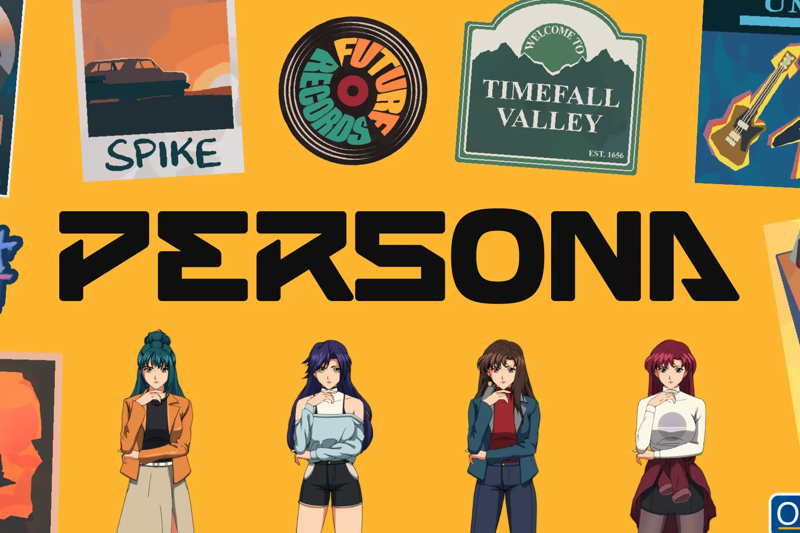
2023Brand & visual designer
Unagi didn’t want a profile picture. They wanted a place. I designed the town around it: the soda in the fridge, the sign at the station, the poster peeling off a phone booth. Twenty small brands that look like they’ve always been there.
20+Brands designed for one fictional town
60+Props, decals and signs
8,888Avatars, sold out at launch (Feb 2024)
The brief
Unagi, a games studio founded by ex-Ubisoft executives, was launching Persona: a retro-anime IP and an 8,888-piece avatar collection.
It had to be more than a profile picture. It had to be a place: a 90s-flavoured anime town called Timefall Valley that fans could step into, read about, and come back to.
A logo and a palette only cover half of that. A believable world is full of brands nobody thinks about. My job was to design that layer, and make it look as if it had always been there.
- Client
- Unagi
- Role
- Brand & visual designer
- Year
- 2023 · launched Feb 2024
- Tools
- Illustrator, Photoshop
- Result
- 8,888 avatars sold out at launch
What I did
- In-world branding
- Props & decals
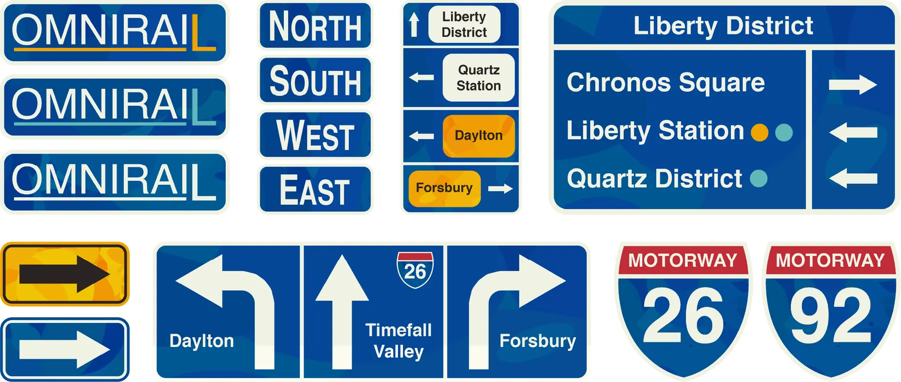
- Wayfinding
- Character concepts
- Avatar traits
- Motion
A town that doesn’t exist
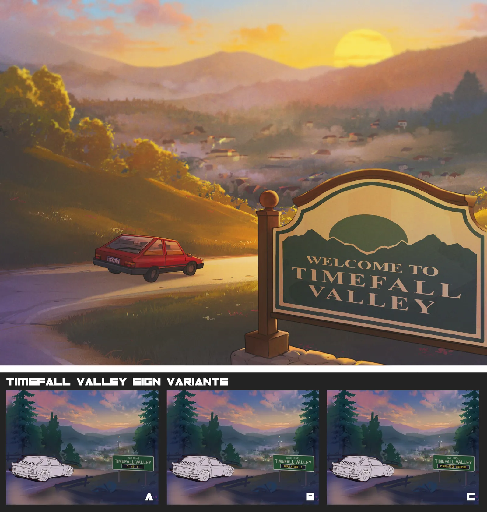
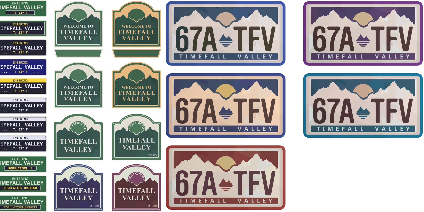
To make Timefall Valley feel lived in, I designed the businesses, transit, media and street culture a real town collects over decades. Each one got its own logo, palette and personality. All of them share Persona’s flat-shape, sun-faded print style. Browse the town.
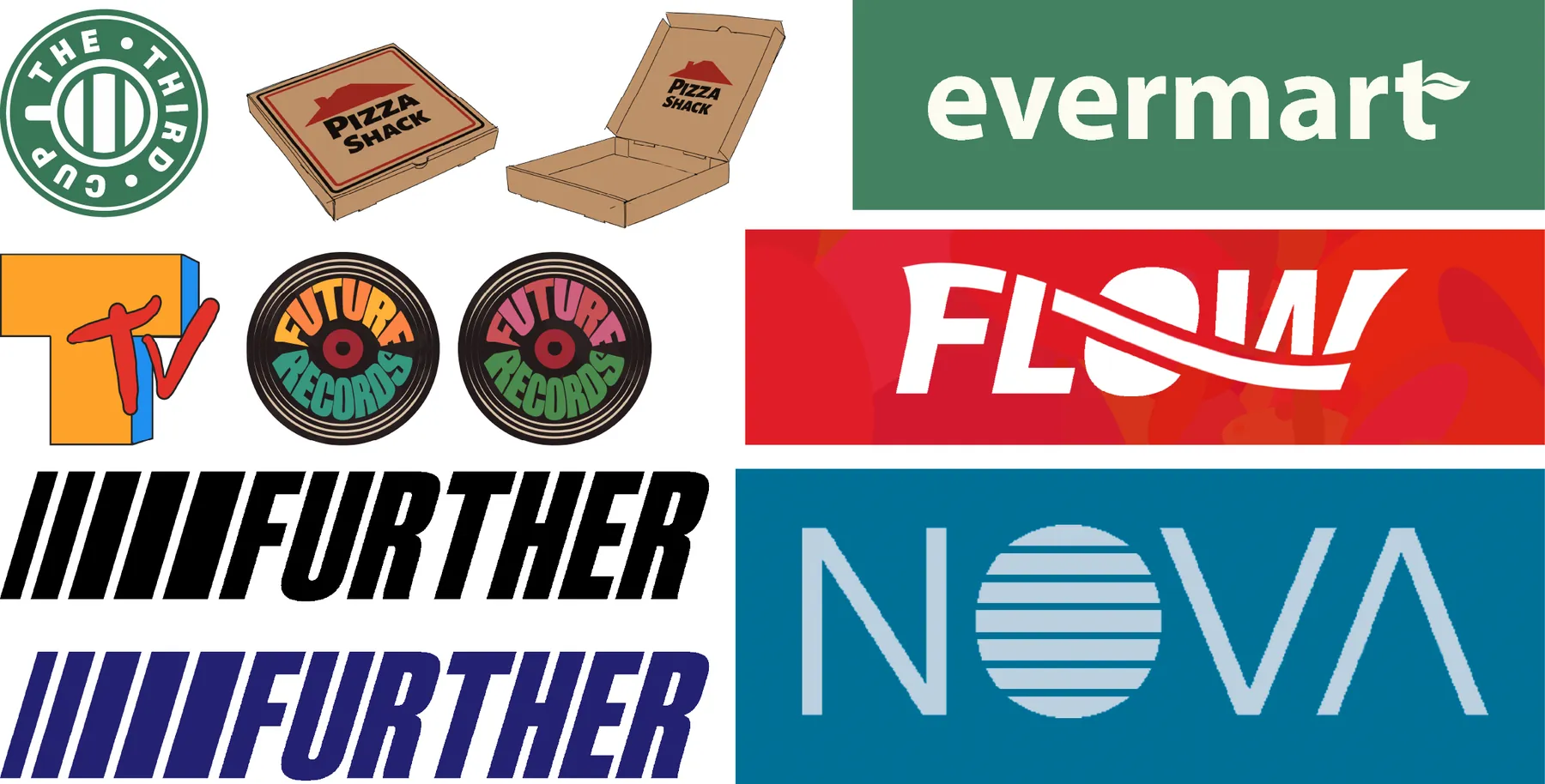
Brands: Shops, cafés and labels: The Third Cup, Pizza Shack, Evermart, Flow soda, Future Records, Nova and more.
The rules of Timefall Valley
Twenty brands by one designer can easily look like twenty brands by one designer. These rules kept them feeling like one town.
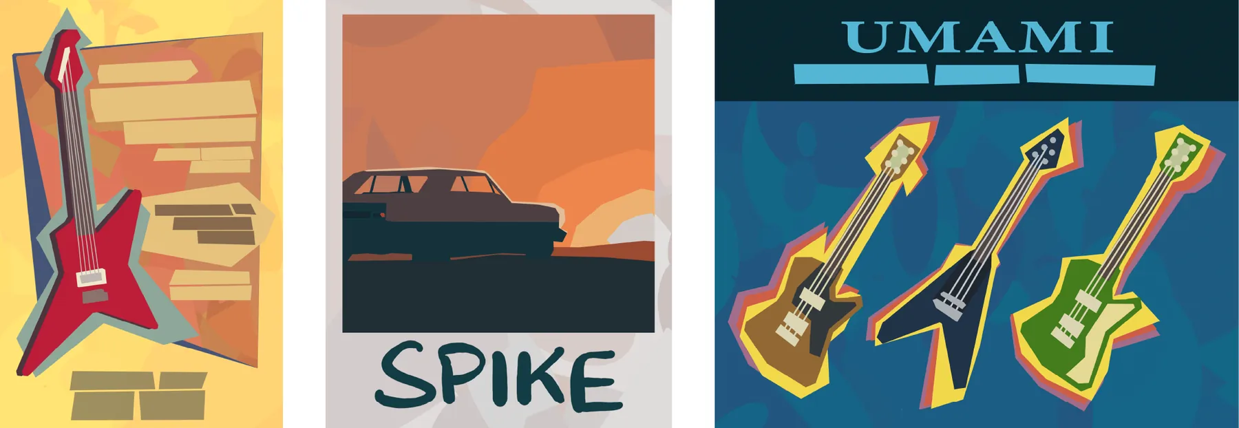
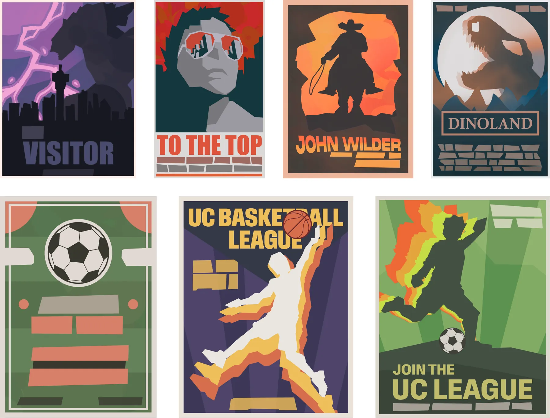
Body copy becomes blocked bars, so props read from a distance, never compete with the scene, and stay language-neutral.
The brands are inspired by real ones people know. Viewers half-recognise them, so the town feels familiar straight away, and that brings belonging and nostalgia.
Key props went through several rounds of colour, layout and detail. Only the versions that sat most naturally in the world made it into the scenes.
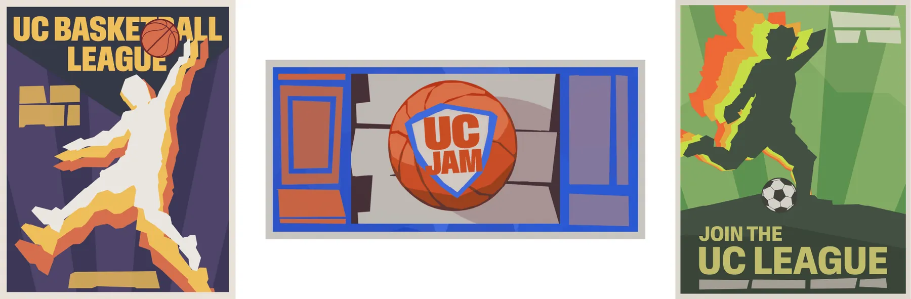
Easter eggs tie the town back to the brand: the P signet on screens, Spike’s name on a poster, and the UC leagues promoting Unagi’s own game.
Where the props live
This is where the props earned their keep. My colleague Makasi painted the scene illustrations. I dressed them with the town’s props and decals, and animated them.
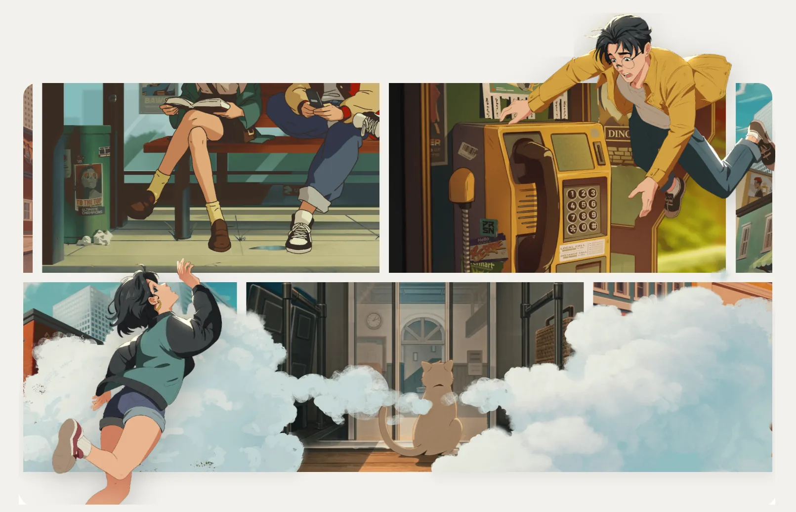
Scene 1 · The payphone
The Dinoland poster, the payphone price card, the Evermart sticker. Each one sits exactly where a real town would put it.
I animated the scene too. It first ran as a promotional animation on X, and now opens Persona’s section of the Unagi website.
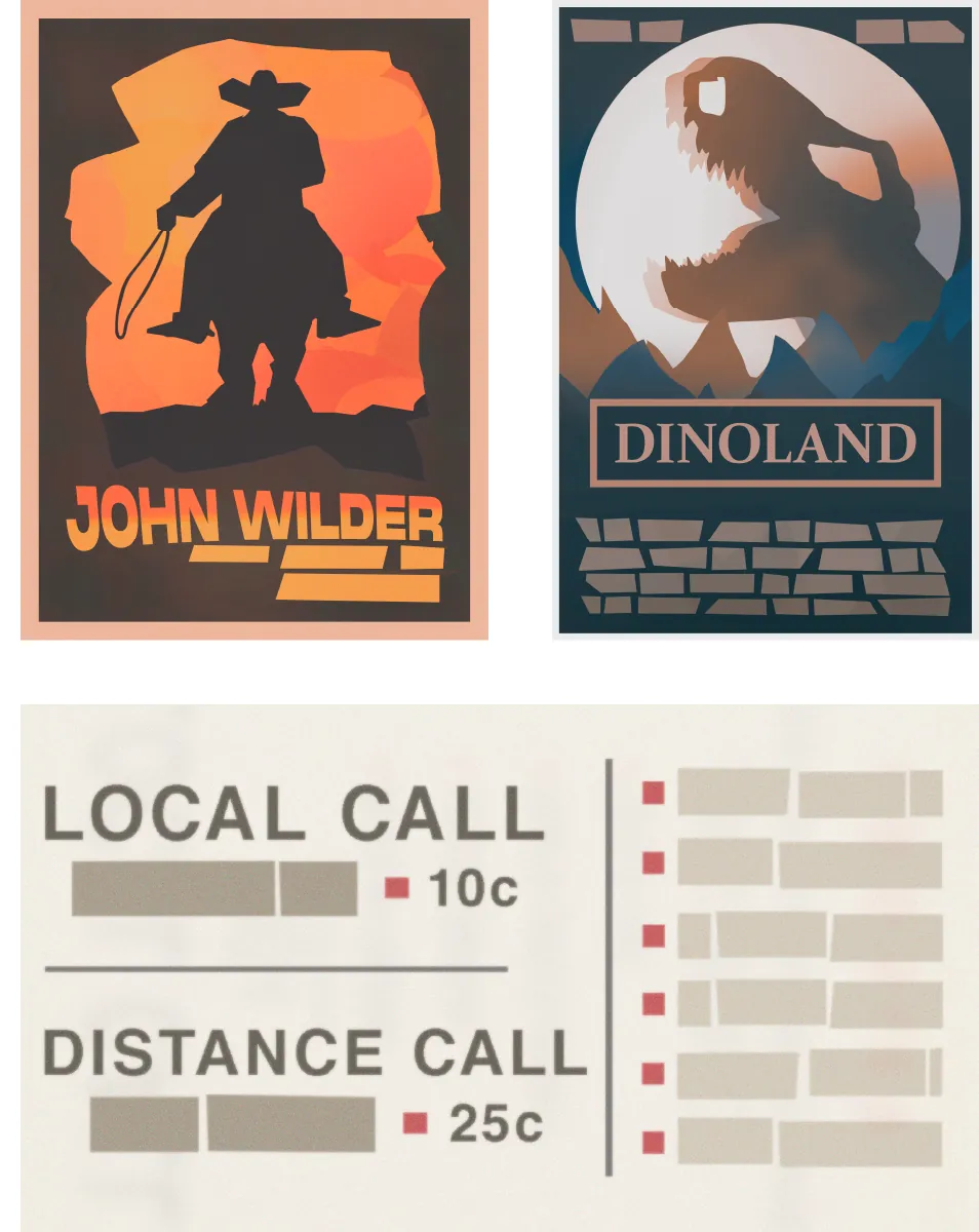
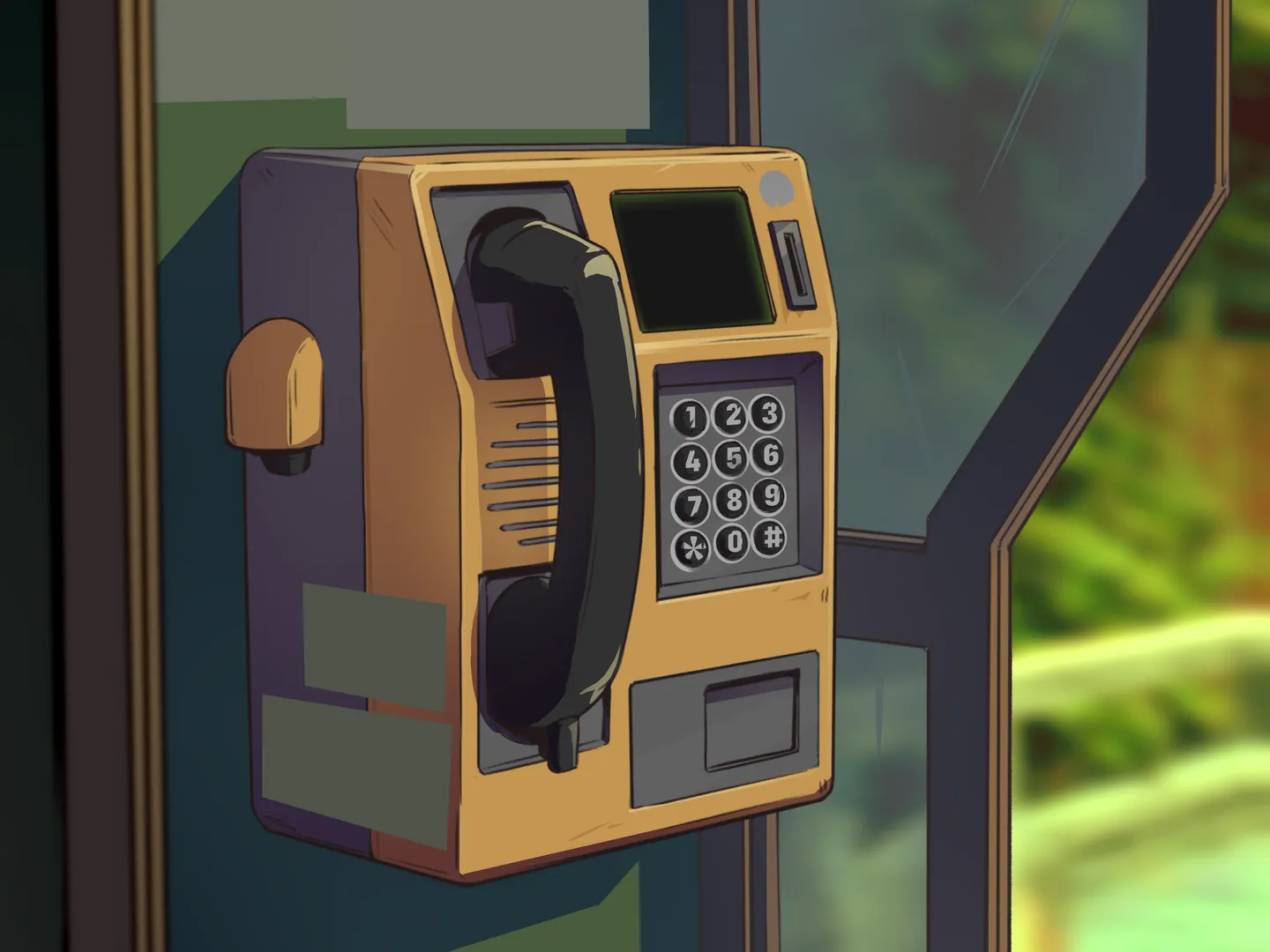 Illustration · MakasiProps & motion · me
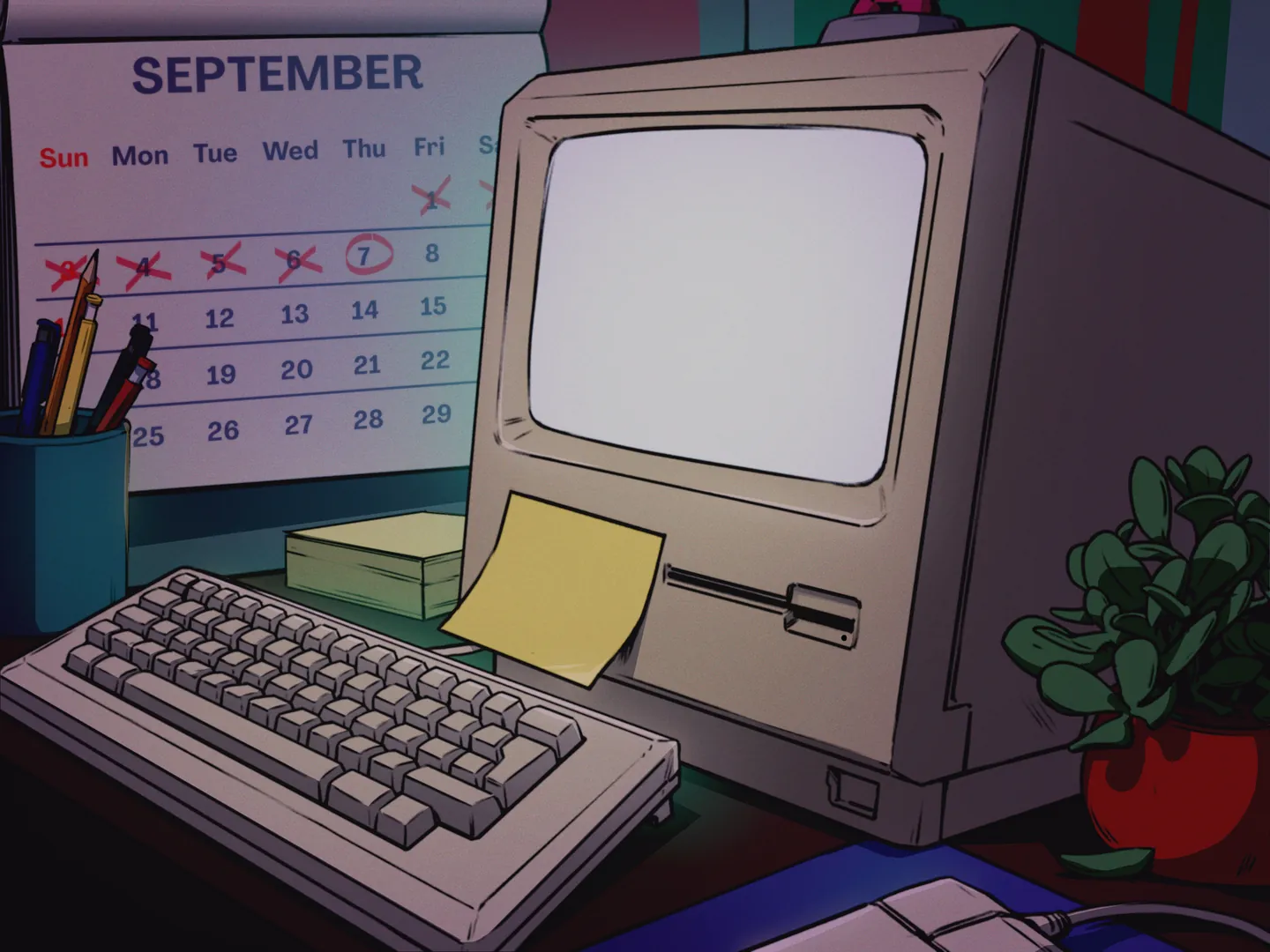 Illustration · MakasiProps & motion · me
Scene 2 · Spike’s desk
The screen shows a stylised take on the original Persona website concept. The blinking keyboard light and the letters on the sticky note hide a code.
I drew the screen, the sticky note, the polaroid, the sticker and the tape, and animated the whole scene myself. It also ran as a promotional animation on X.
Characters & traits
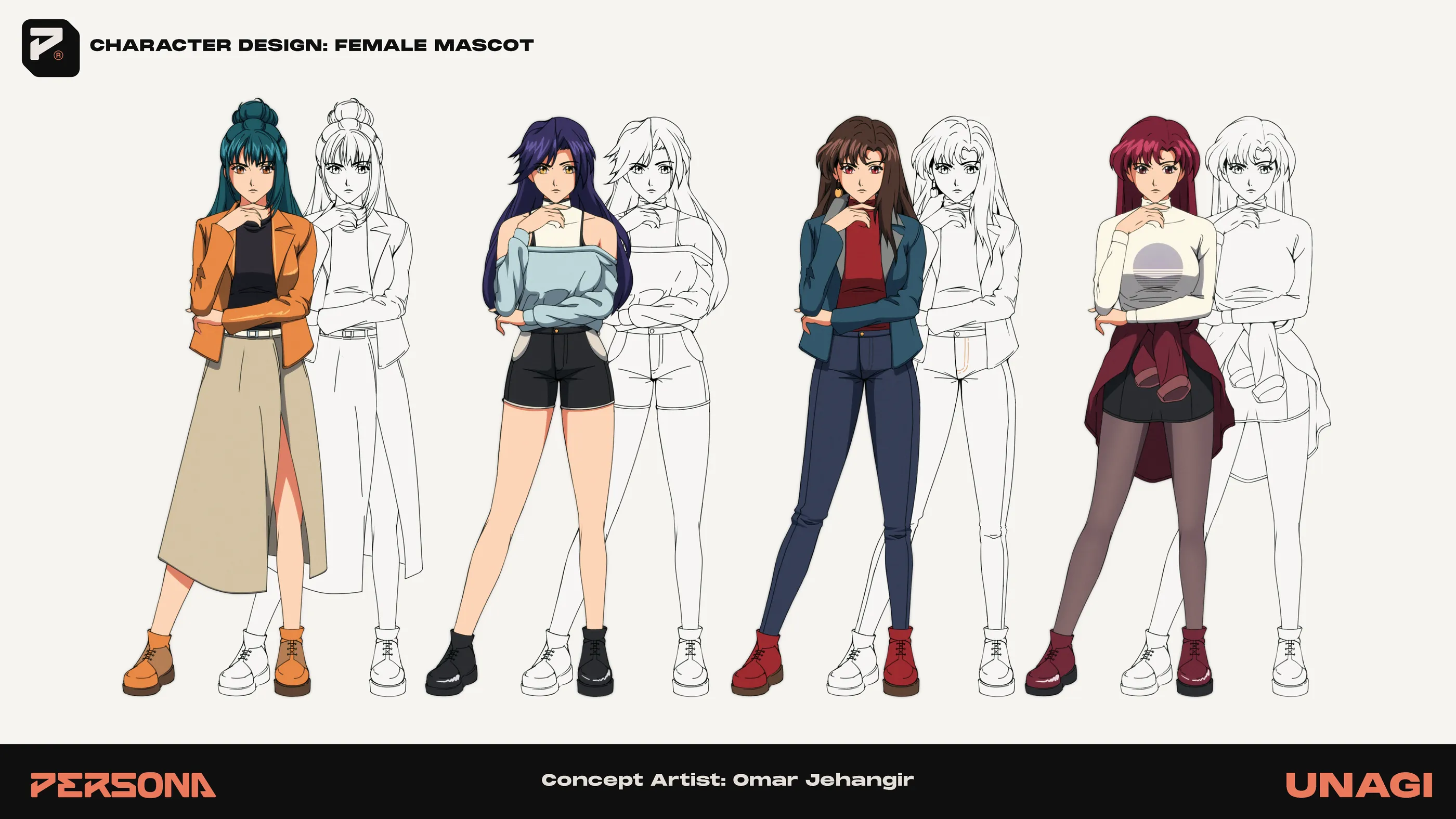
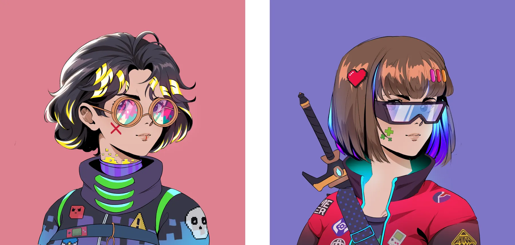
Persona’s characters had to read as 90s anime without becoming pastiche. I explored silhouettes, outfits and line weight for the lead female character, from loose sketch to clean ink, using wardrobe to carry personality: workwear, denim, layered streetwear.
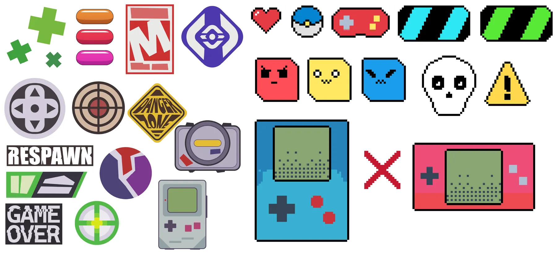
The same world-building fed the avatars. Arcade badges, pixel-art pins and handheld consoles became traits that 8,888 characters could wear.
Living inside the brand
Credit: Persona’s core identity was built by Unagi’s brand team. I contributed to its guidelines.
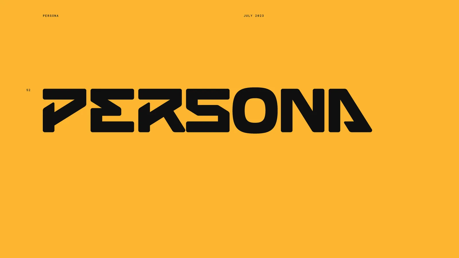
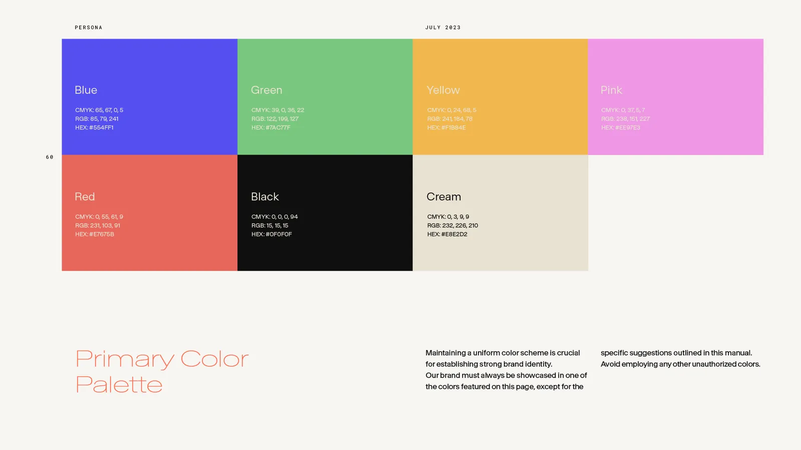
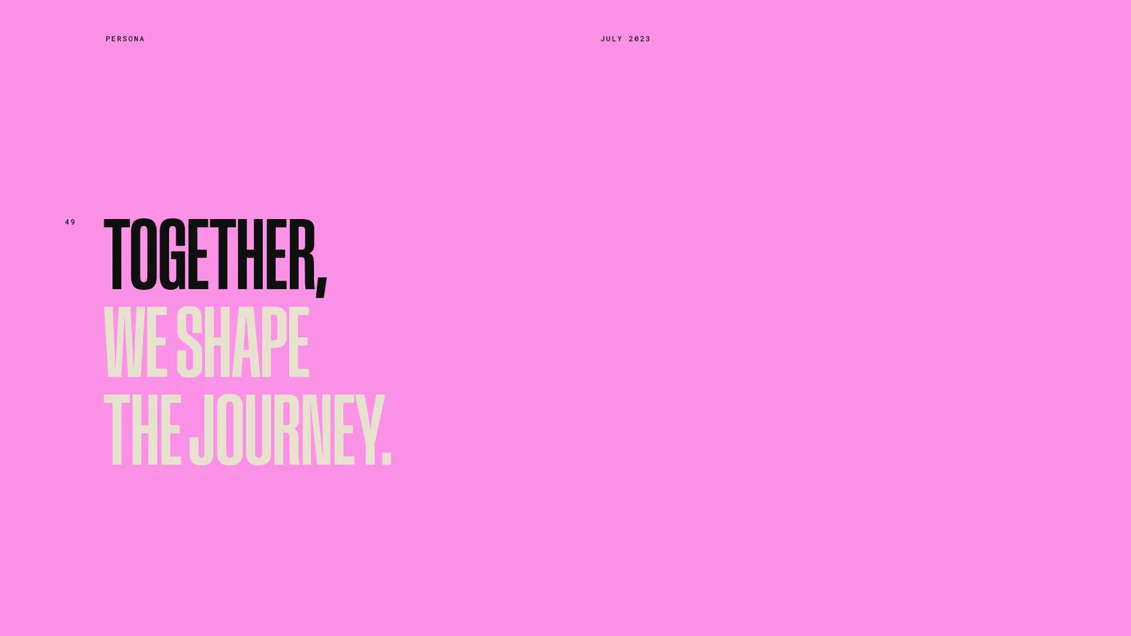
Before a town can feel real, it needs rules. Everything I designed, from the characters to the props, had to live inside this system: a cut-in, sharp-shouldered wordmark, a chunky P signet built to survive at avatar-badge size, seven sun-faded primaries on warm cream, and one line to carry it all.
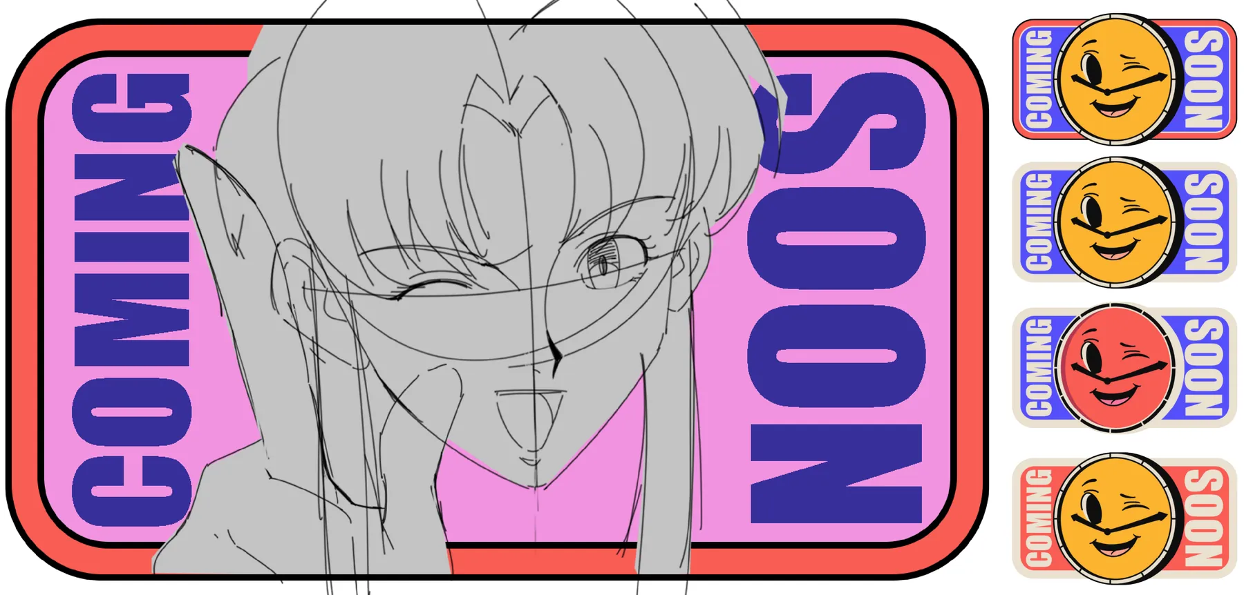
Launch teaser
Before launch, a winking “Coming Soon” sticker teased the drop across socials. Cheeky, collectable, and unmistakably Persona.
Results
Project results, published by Unagi.
8,888Avatars, sold out at launch (Feb 2024)
$5MPrimary sale (1,842 ETH)
400KFans across the Persona world
1MViews on Persona short films
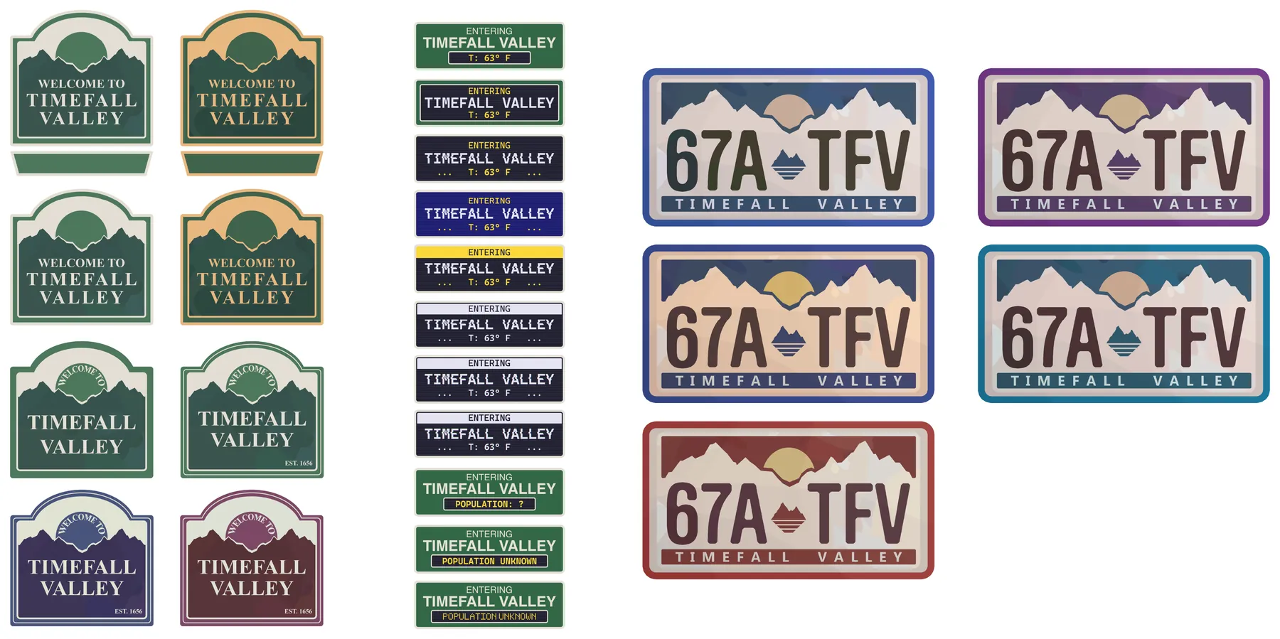
Persona taught me that a brand is only as believable as the world around it. Designing twenty small brands is the closest thing I’ve found to building a real place. Every sign, sticker and licence plate had to feel like it belonged to someone.
I didn’t build that world alone. I worked next to illustrators like Makasi, adding the props, decals and motion that sat inside their scenes. That’s where I learned to design for someone else’s work, not over it.
It’s the mindset I bring to every brand now. Start with the world. Then make the brand that lives in it.
— OmarNow booking
Building a world around your brand?
Your brand could be next.
Remote · on your hours
Next project