Case study · Brand identity & launch art direction
Walkarein
A footwear identity built on one idea: keep moving.
The brief
Walk karein means “let’s walk”: a phrase you hear on every street, said warmly, nudging you forward. Walkarein wanted to be that voice in footwear: the down-to-earth friend who always says “Chalo, let’s go!”
The shoes were made for ordinary Pakistani days: quick errands, the office, Friday prayers. So the brand had to be friendly and approachable, never preachy, and practical, never precious. The brief set four values, listed below.
Two practical requirements shaped everything after: type had to sit comfortably beside Urdu, and the imagery had to show real people, not models posing in a catalogue.
- Client
- Walkarein, Pakistan
- Role
- Brand designer & art director
- Year
- 2025
- Tools
- Illustrator, Photoshop, Lightroom
- Status
- Launch-ready, unreleased
What I did
- Logo
- Identity system
- Art direction
- Shoot direction
- Packaging
- Retail touchpoints
The four values
- 1Comfort for every step, without feeling sleepy
- 2Everyday versatility, without going generic
- 3Local pride, seen through a modern lens
- 4Movement, both literal and as a push to step into your day
The context
The closest regional reference was Walkaroo, India’s mass-market footwear brand: a leaping-kangaroo mascot, loud red and yellow, a slanted wordmark. It works for energy, but it shouts. Walkarein needed the same sense of movement in a calmer, more grown-up register, one that could sit in a mall and on a Liberty Market stall alike.
So I looked for movement in the street itself: zebra crossings, painted lane arrows, the stacked rhythm of feet on a busy crossing.

The logo
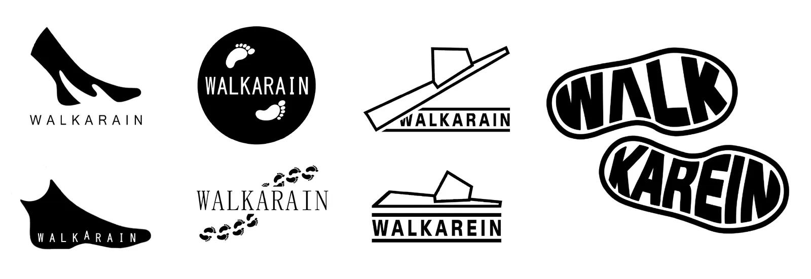
The first routes took walking literally. Then they got simpler, until only the rhythm was left.
- The shoe. Silhouettes of a heel, a sandal and a sole. Too literal, and it locked the brand to one product.
- The footprint. A circular badge and a trail of steps across the name. Friendly, but a trope every shoe brand has used.
- The sandal line. A single-stroke slipper drawn over a baseline. Elegant, but it disappeared at small sizes.
- The sole. “WALK” and “KAREIN” set inside two shoe soles, stepping forward. Playful, but too busy for a mark.
- The chevron. Stacked Ws that read as arrows and as a crossing. This one survived.

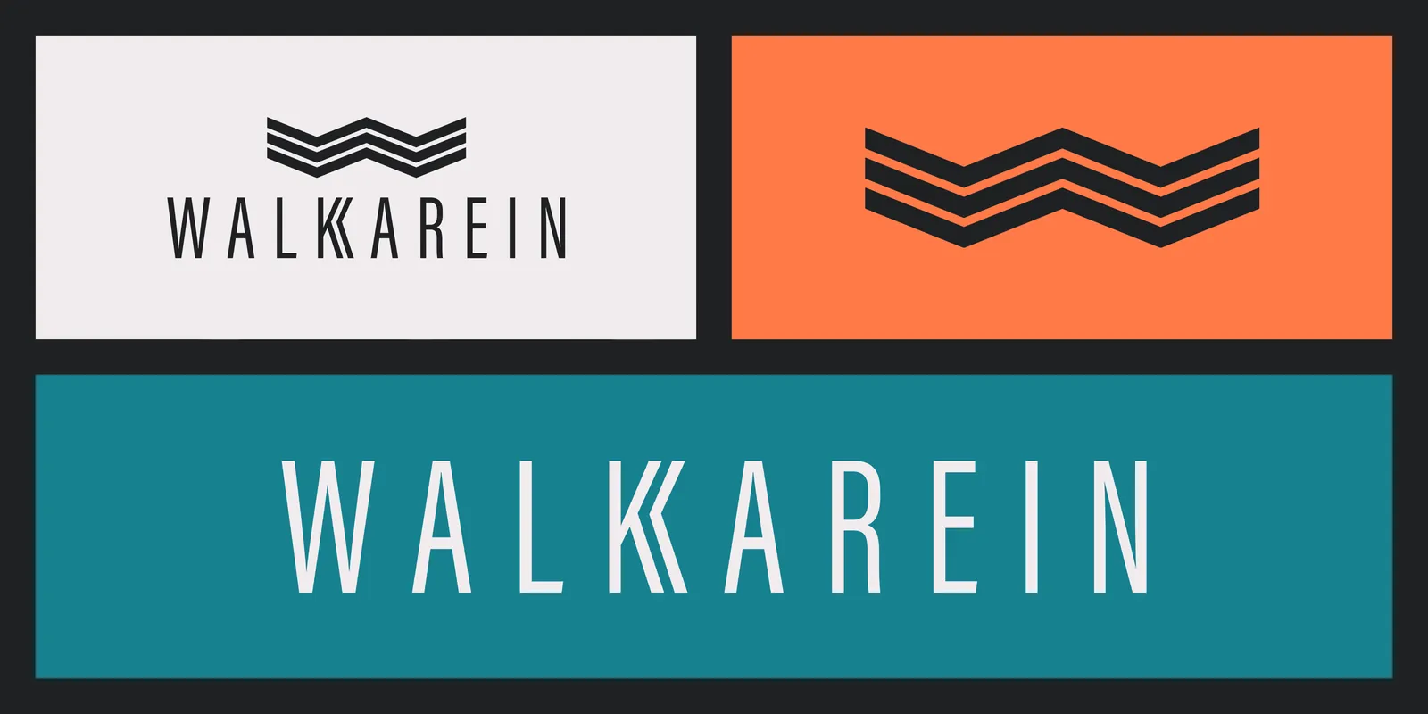
The answer was the W in Walkarein, stretched and stacked three times. Read it one way and it is a letter. Read it another and it becomes:
- ArrowsPointing down and forward, carrying weight and direction.
- A zebra crossingThe repeated bars of the place where everyone walks.
- A strideThree beats, like steps in sequence.
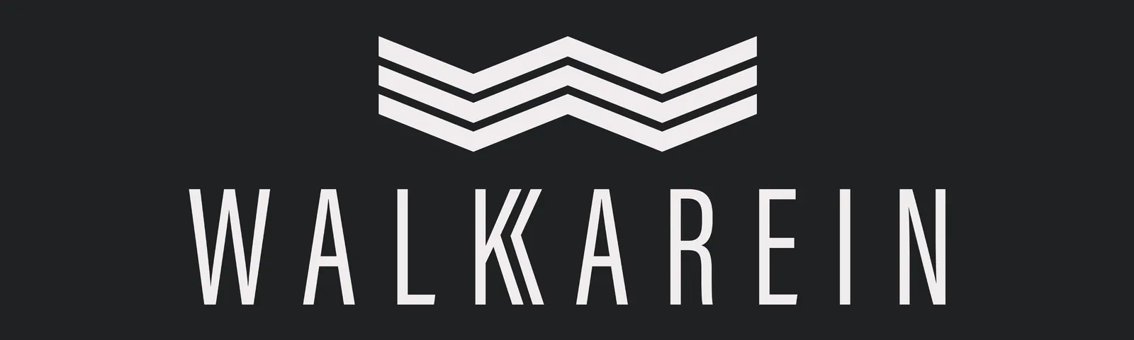
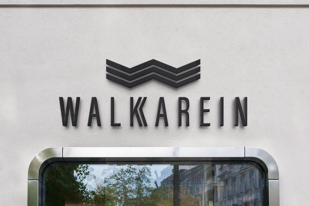
It is simple enough to emboss on a sole and strong enough to fill a wall. Each chevron shares one angle and one stroke weight, with equal gaps between them. That keeps the mark crisp at 16 px as a favicon and at 3 m on a shopfront.
The wordmark is set in Acumin Extra Condensed: tall, upright and balanced. One detail carries the name: the K is doubled, so Walk-karein is spelled in the shapes themselves, like one foot stepping after the other.
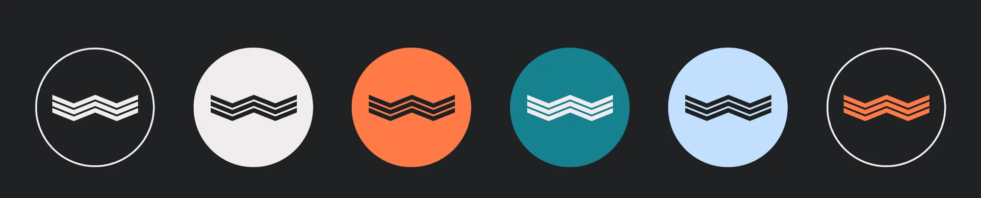
The mark and wordmark work as a stacked lockup, a wordmark on its own, and the mark alone for small spaces.
The color palette
The palette pairs the dust and warmth of the street with the freshness of something new. Urban Charcoal anchors the identity with structure and clarity, Ivory Breeze adds softness and breathing room, Desert Blush radiates warmth and skin tones, Sunset Glow brings energy, Deep Teal reflects movement, and Sky Haze gives openness. Every color was chosen to walk the line between grit and polish.
- #1F2123Urban Charcoal
- #F1ECEEIvory Breeze
- #FF7A48Sunset Glow
- #178190Deep Teal
- #C2DFFFSky Haze
- #EBC6A6Desert Blush
The typography
Acumin Extra Condensed carries the wordmark and big headlines: condensed, upright, a little architectural. Raleway does the everyday work on labels, product cards and social posts. It is clean enough for screens and friendly enough for a shoebox.
The graphic system
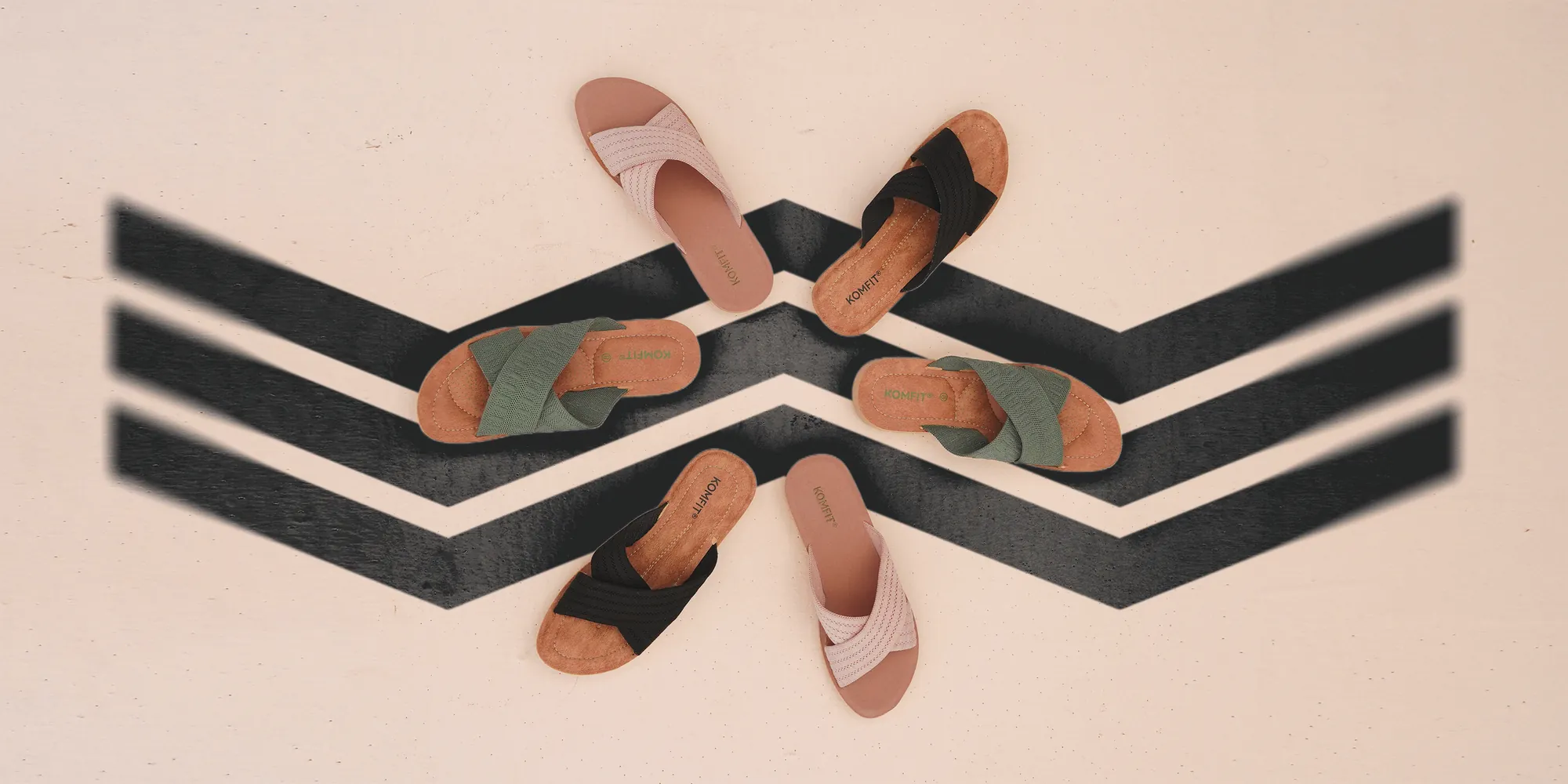
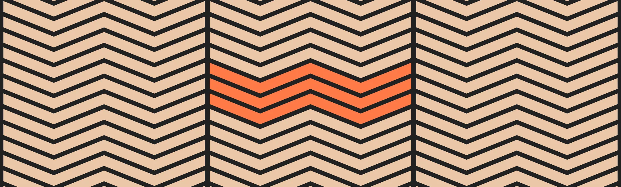
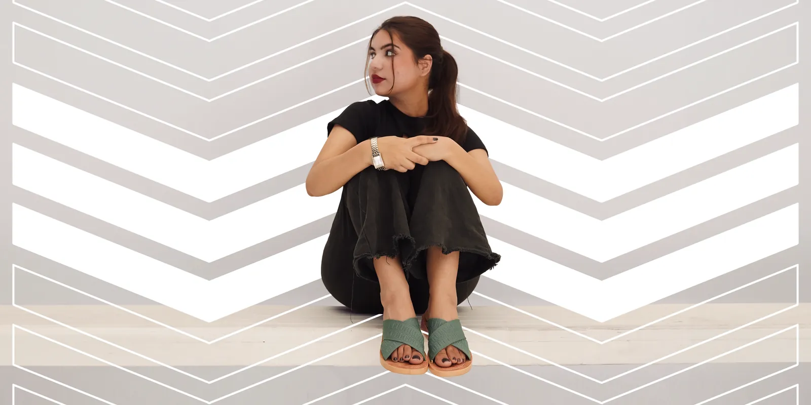
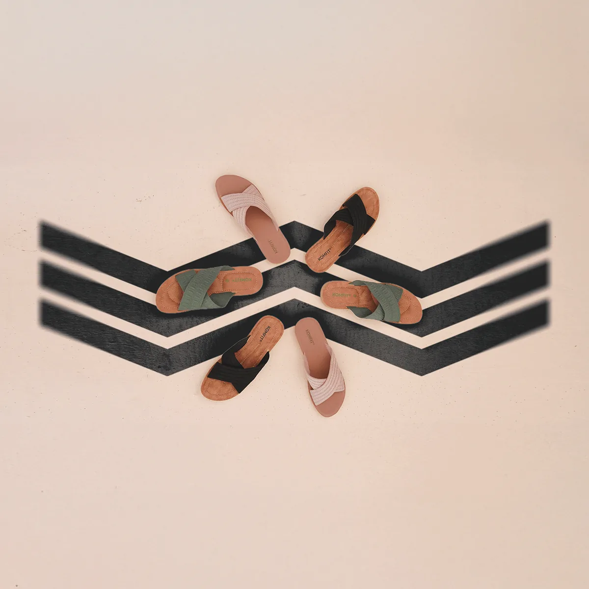
The three Ws were never meant to stay in the corner. Repeated, scaled and cropped, they become a pattern. After the shoot I composited them into the photographs: under the products, behind the people. The brand stays recognisable even with the name out of frame.
The art direction
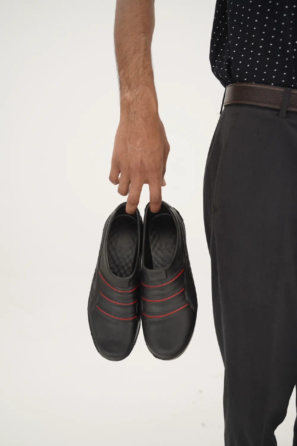
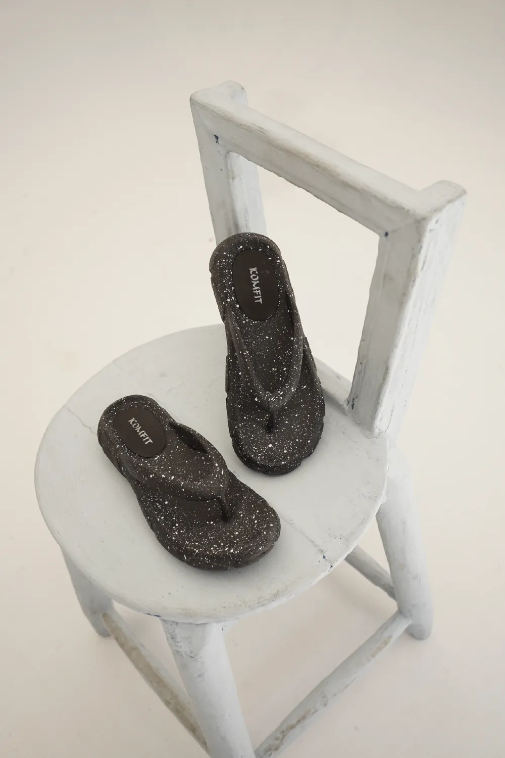
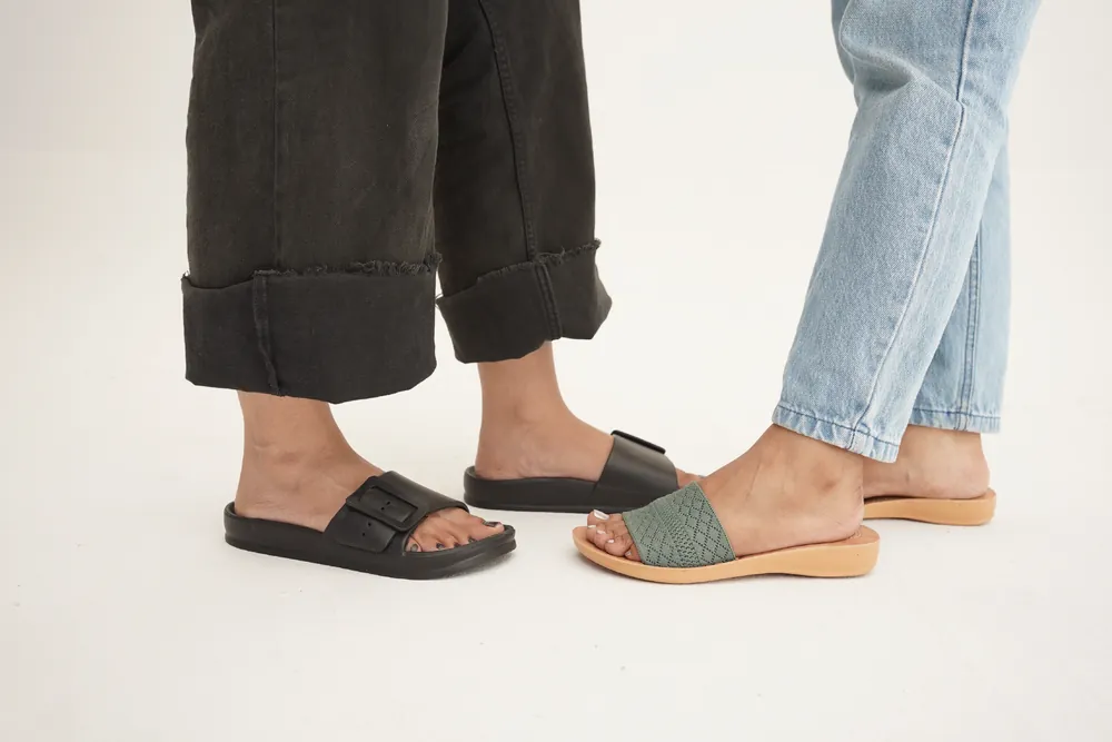
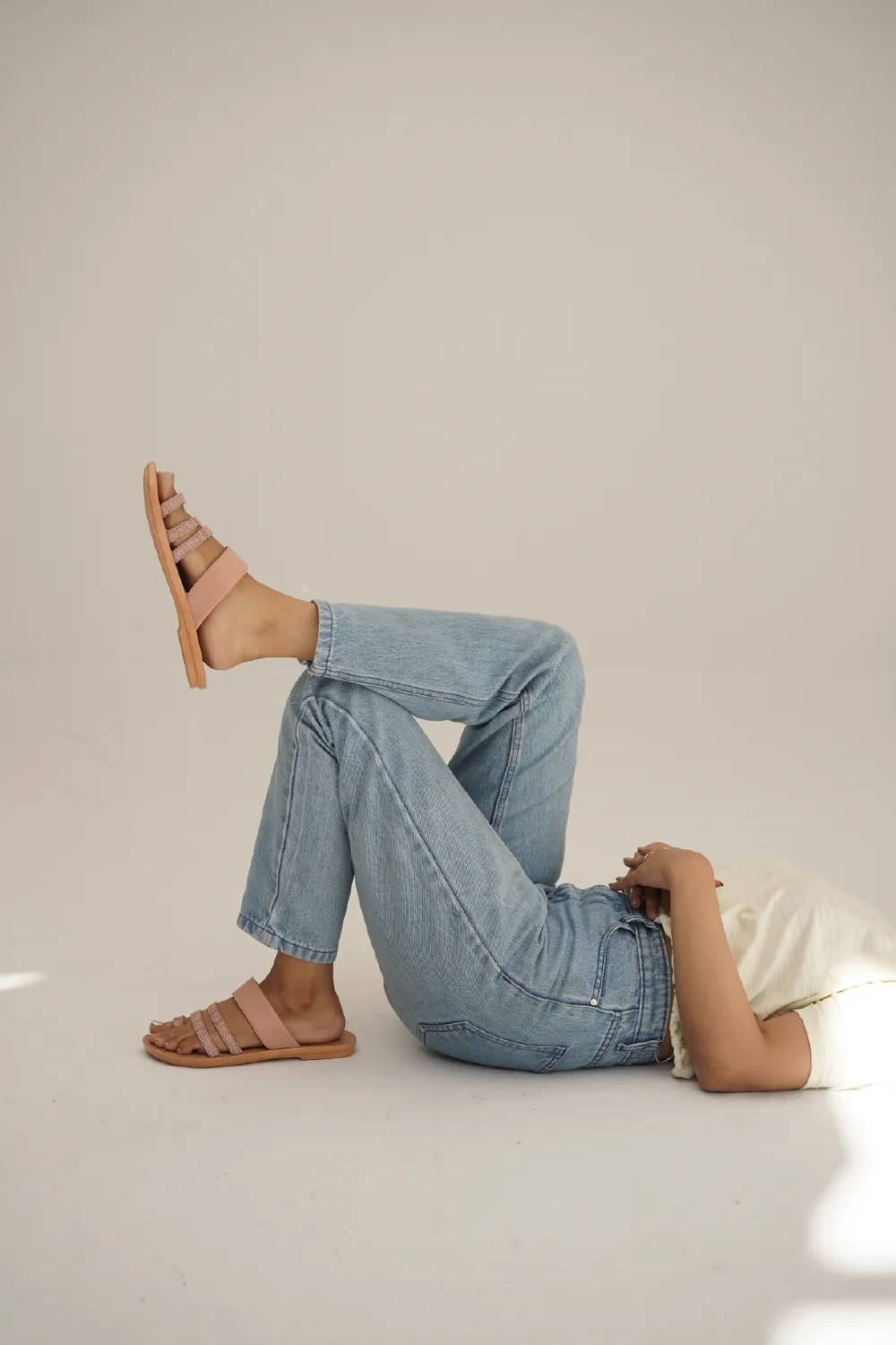
For the launch collection I directed the studio shoot in person: plain backdrops, warm neutrals, everyday styling, and people who look like they’ve just stopped walking, not posing for a catalogue. In post-production I composited the chevron system into the frames, so the photographs and the identity read as one.
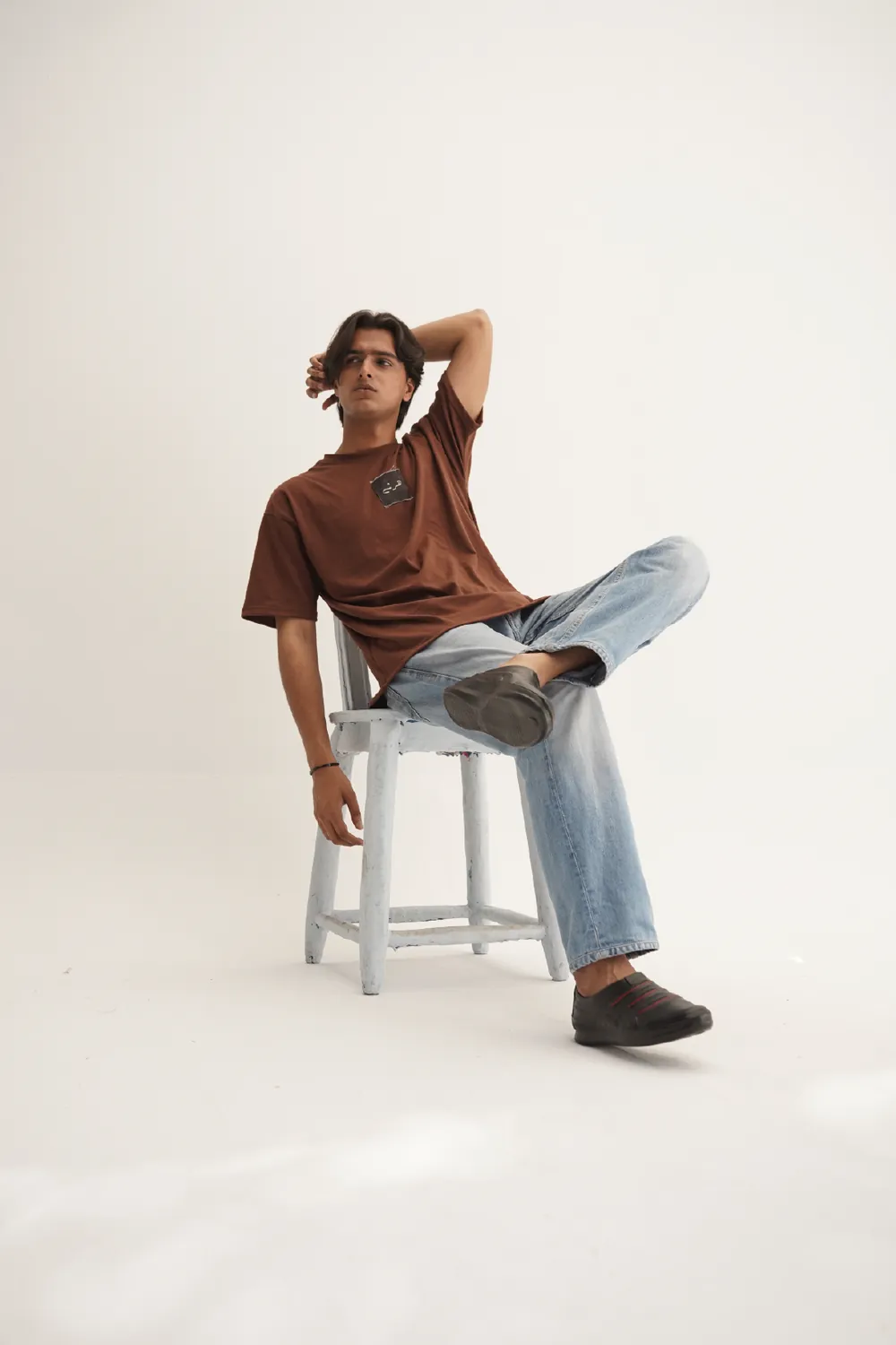
The visual system
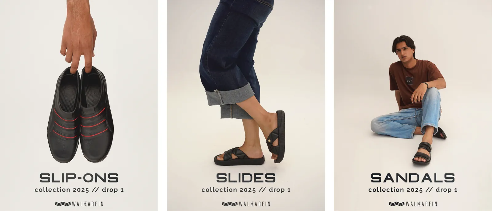
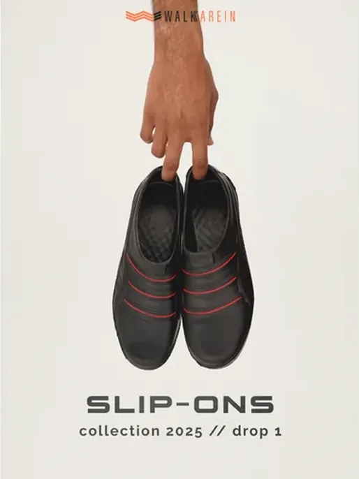
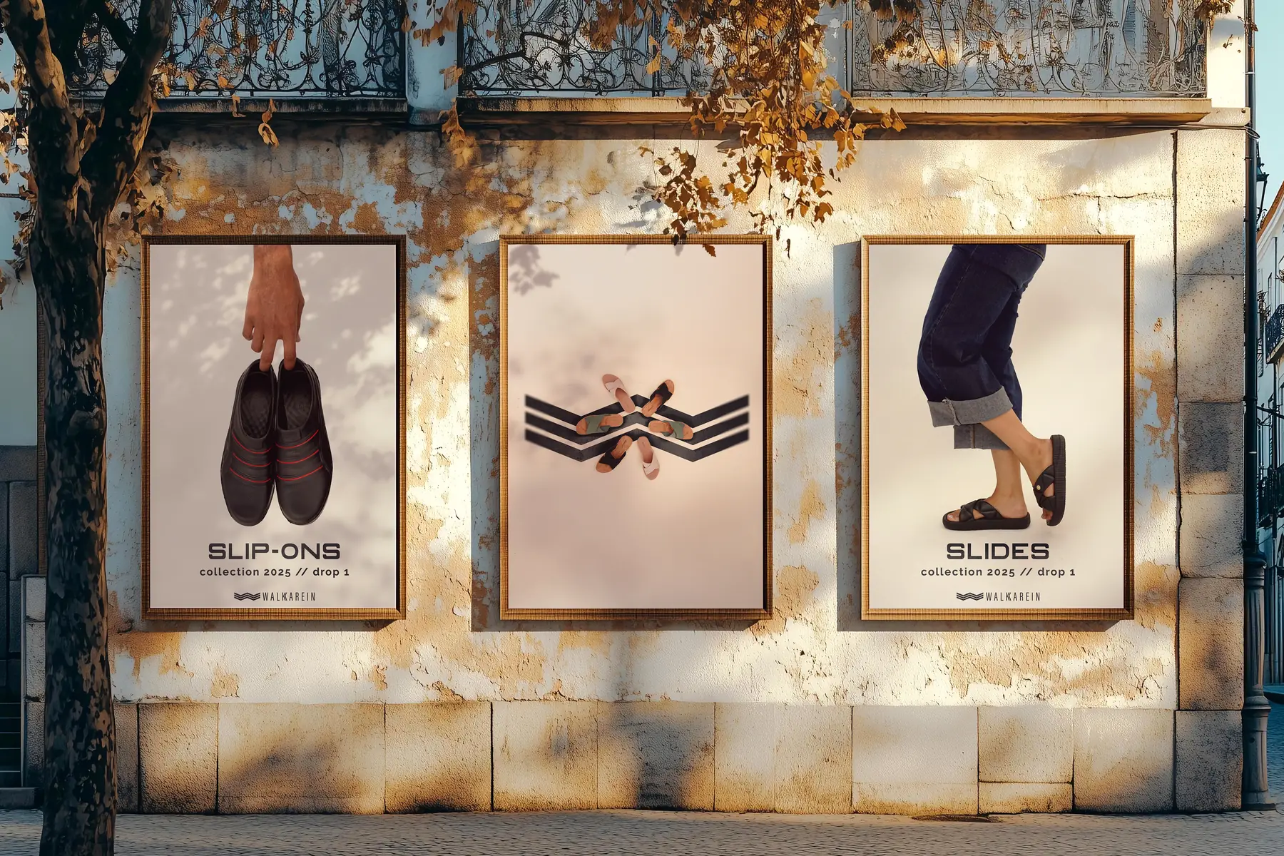
A launch needs dozens of posts, and a small team can’t art-direct each one. So I built one template that any product drops into. The shoe leads, shot on a plain backdrop. The category name sits beneath it in wide, confident capitals. Then a quiet line, collection 2025 // drop 1, and the mark signs off at the foot.
The double slash is borrowed from the logo: two strokes leaning forward, mid-stride. Nothing changes between products except the photo and the word, so a feed of slip-ons, sandals and slides still reads as one brand.
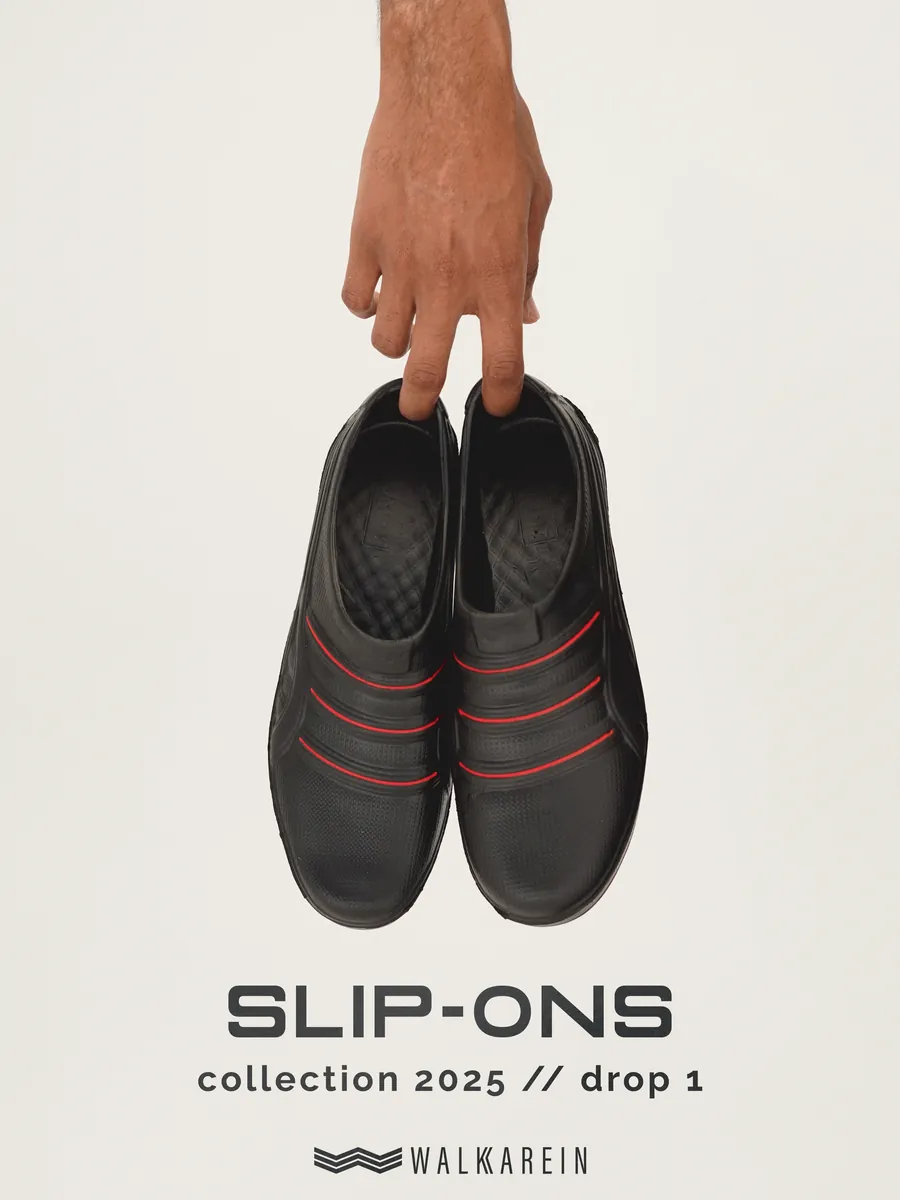
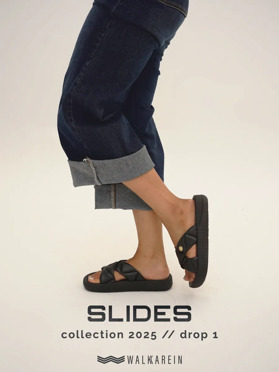
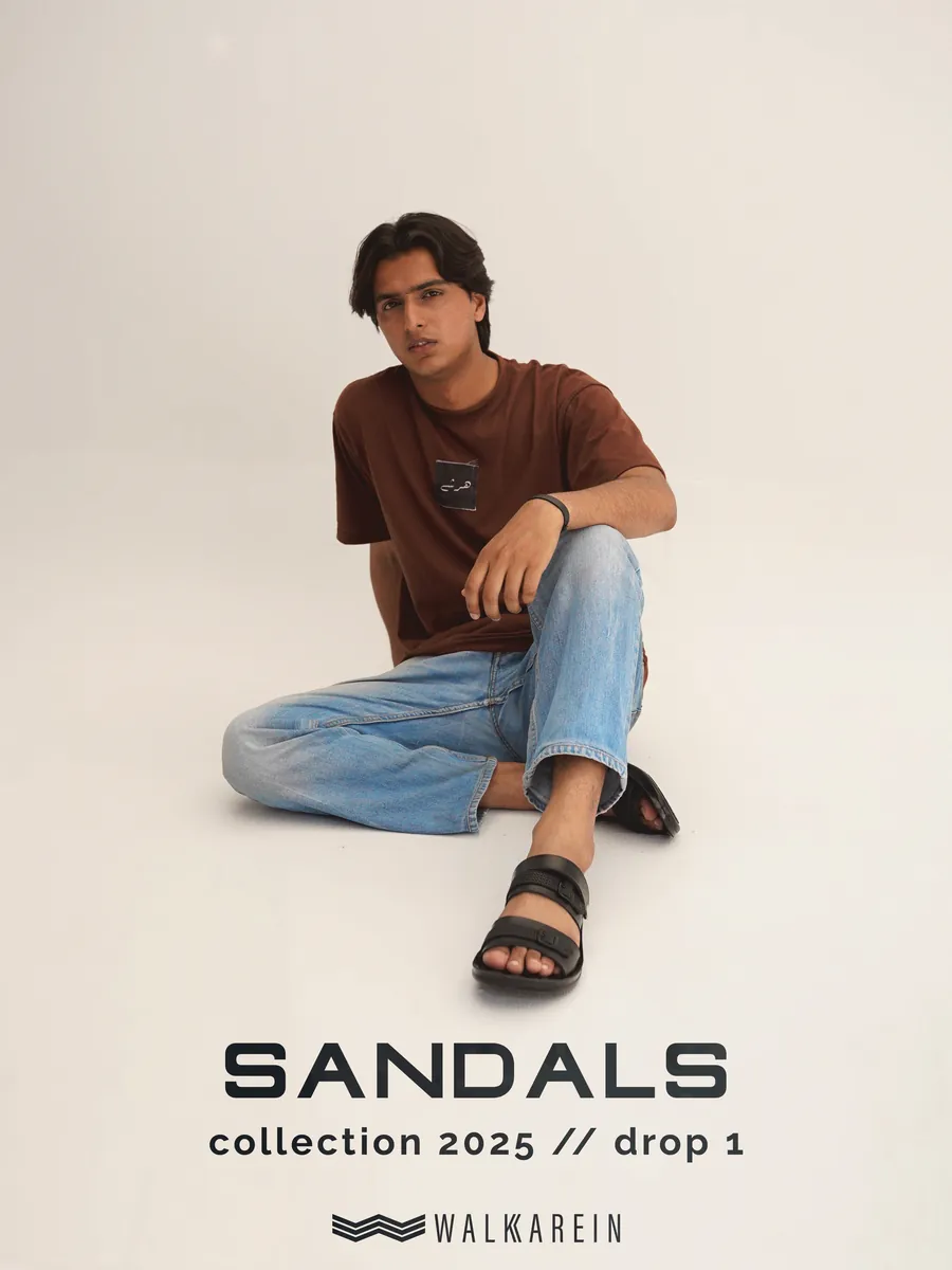
Three products, one frame. Only the photo and the word change, so every post in the drop still reads as Walkarein.
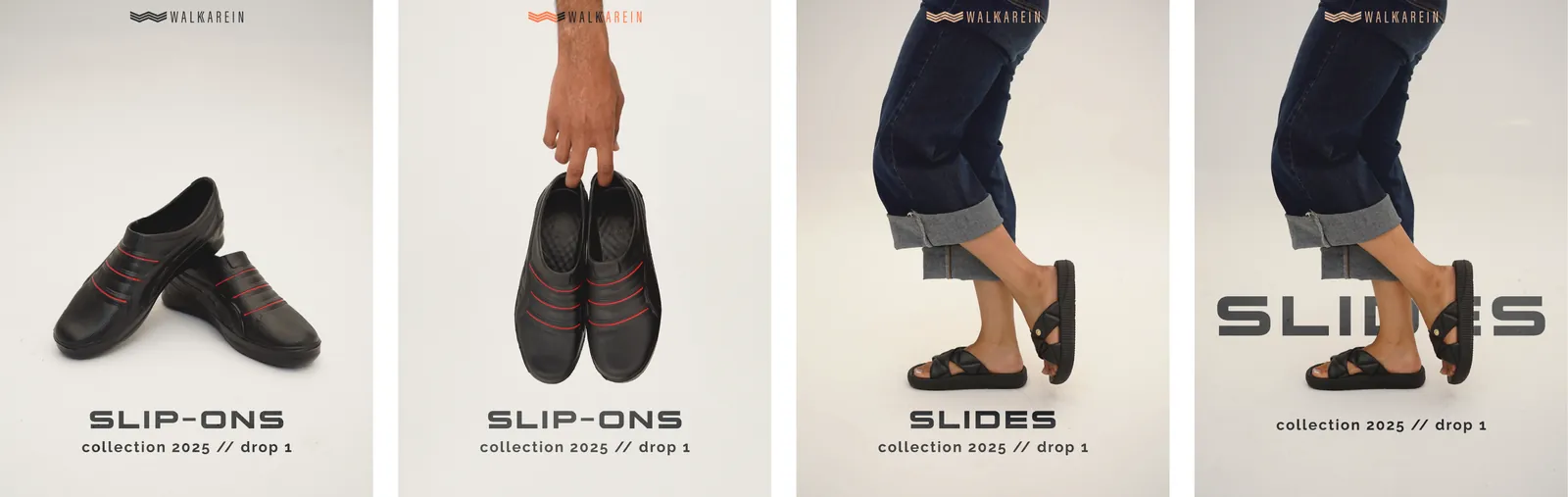
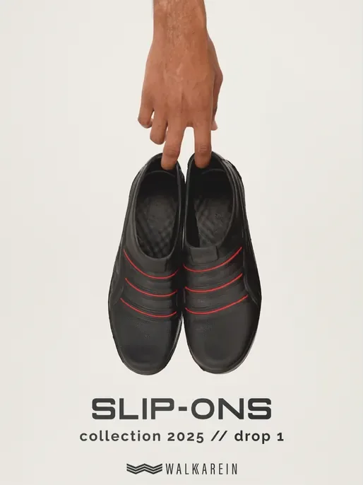
Before: the logo at the top competes with the product.
The applications
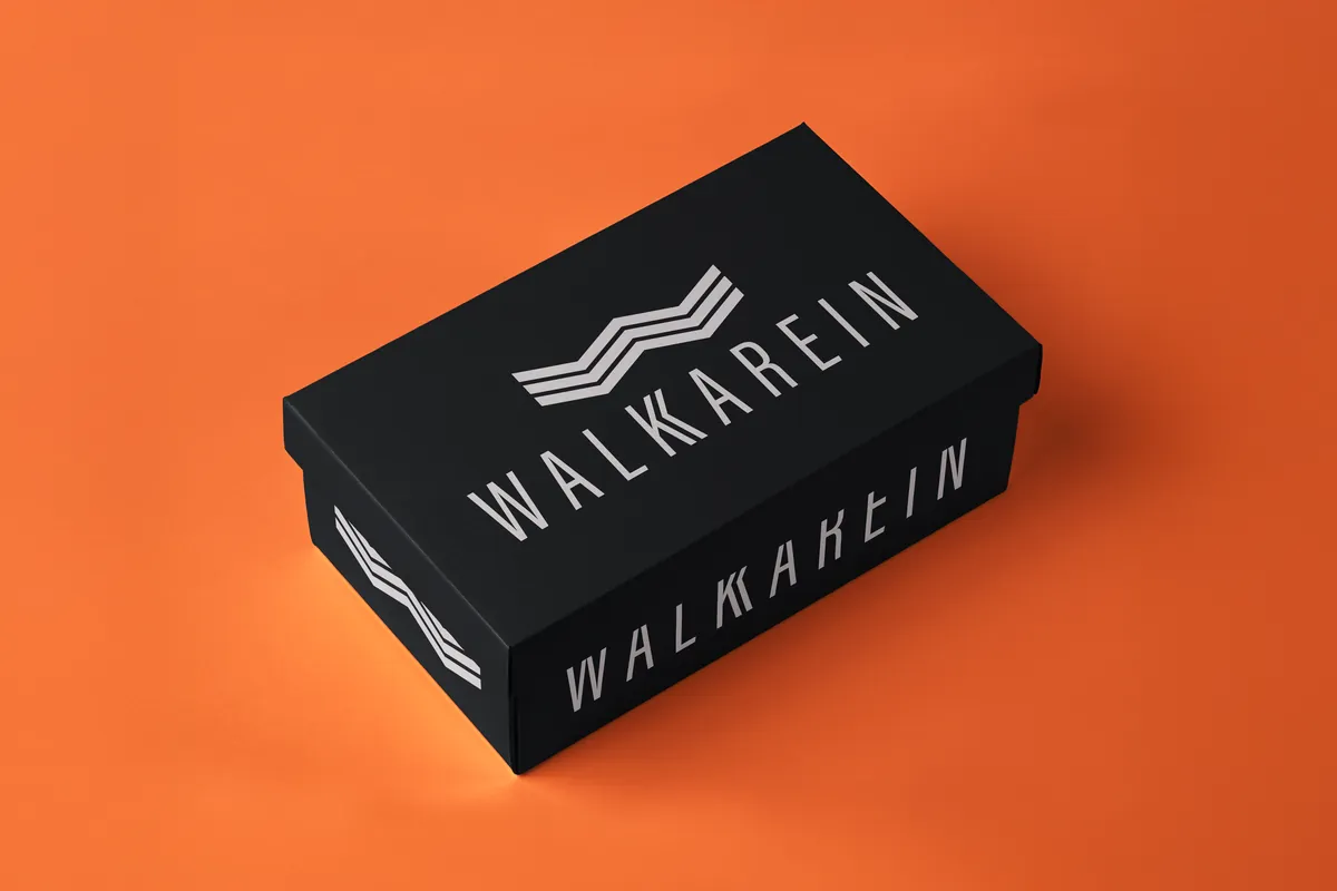
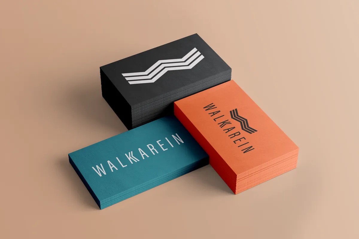
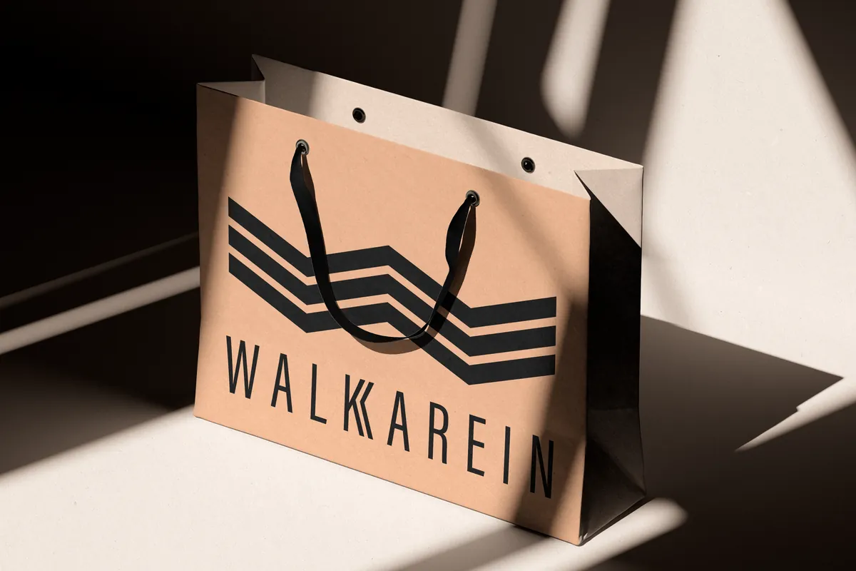
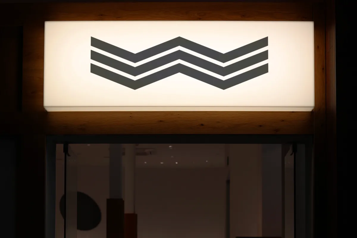
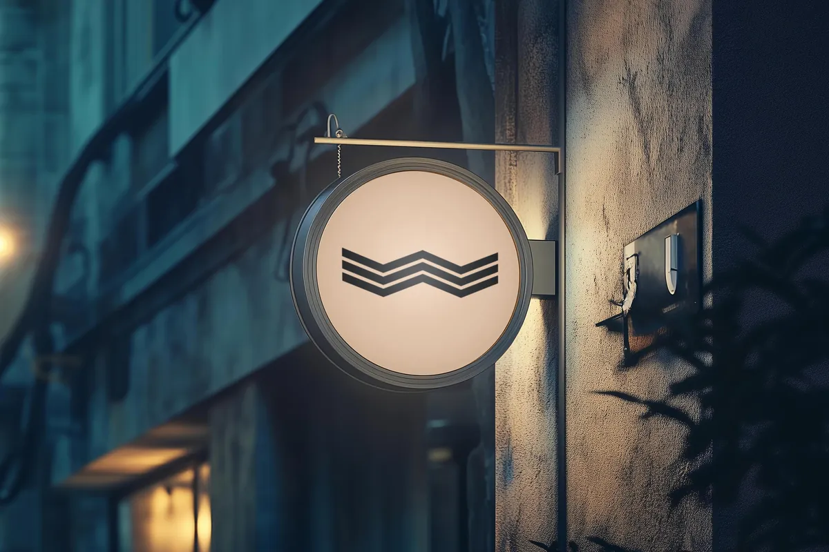
The mark was tested where people actually meet it: the box they open, the bag they carry out, the sign they walk under, and the icon they tap.
The outcome
Walkarein reached a full identity and a shot first collection, then paused before public launch when the business changed ownership. The work stands as a complete, launch-ready system: a mark that holds from favicon to shopfront, a palette with clear roles, and an art direction that turns the logo into the setting itself.
Now booking
Launching a brand from scratch?
Your brand could be next.
Remote · on your hours
Next project