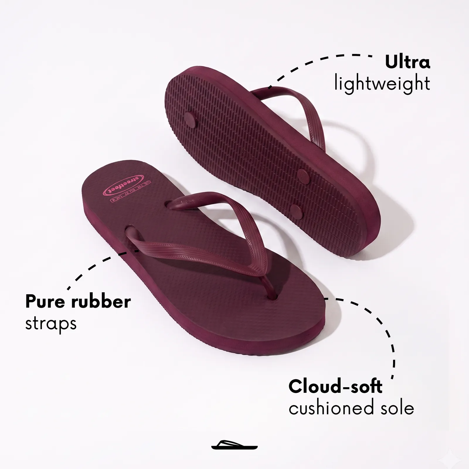
One line carries the brand, “Like walking on clouds,” and every headline builds on it: soft, flexible, light.
Case study · Brand refresh & creative direction
Repositioning a functional flip-flop brand as an aspirational summer lifestyle brand.
Streetfeet is a Pakistani footwear brand known for comfort-focused flip-flops and casual chappals built for hot local summers. The product was strong, but in a crowded DTC market full of low-cost competitors, the brand had no visual story that justified paying more.
Its existing visuals had no consistency or guidelines to follow. Without a distinct visual narrative, shoppers had no reason to choose it over a cheaper alternative.
The goal was to reposition Streetfeet from a functional purchase into an aspirational summer lifestyle brand, and to make that repositioning improve direct-to-consumer ad performance, not just perception.
Since July 2024, I’ve been Streetfeet’s retained brand designer and creative lead. I refreshed the identity, built the brand system, directed the shoots and designed the performance campaigns that sell the product online.
What I did
Instead of competing on price, Streetfeet would sell a feeling: summer comfort. Three decisions shaped everything.
One line carries the brand, “Like walking on clouds,” and every headline builds on it: soft, flexible, light.
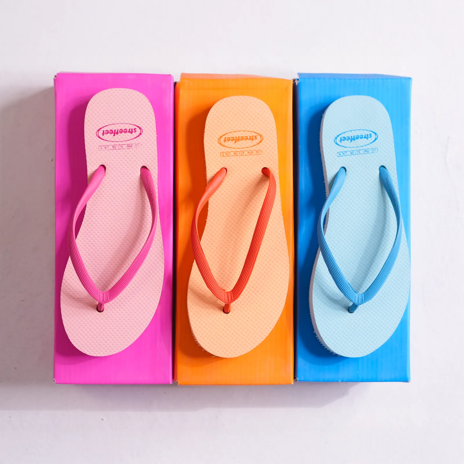
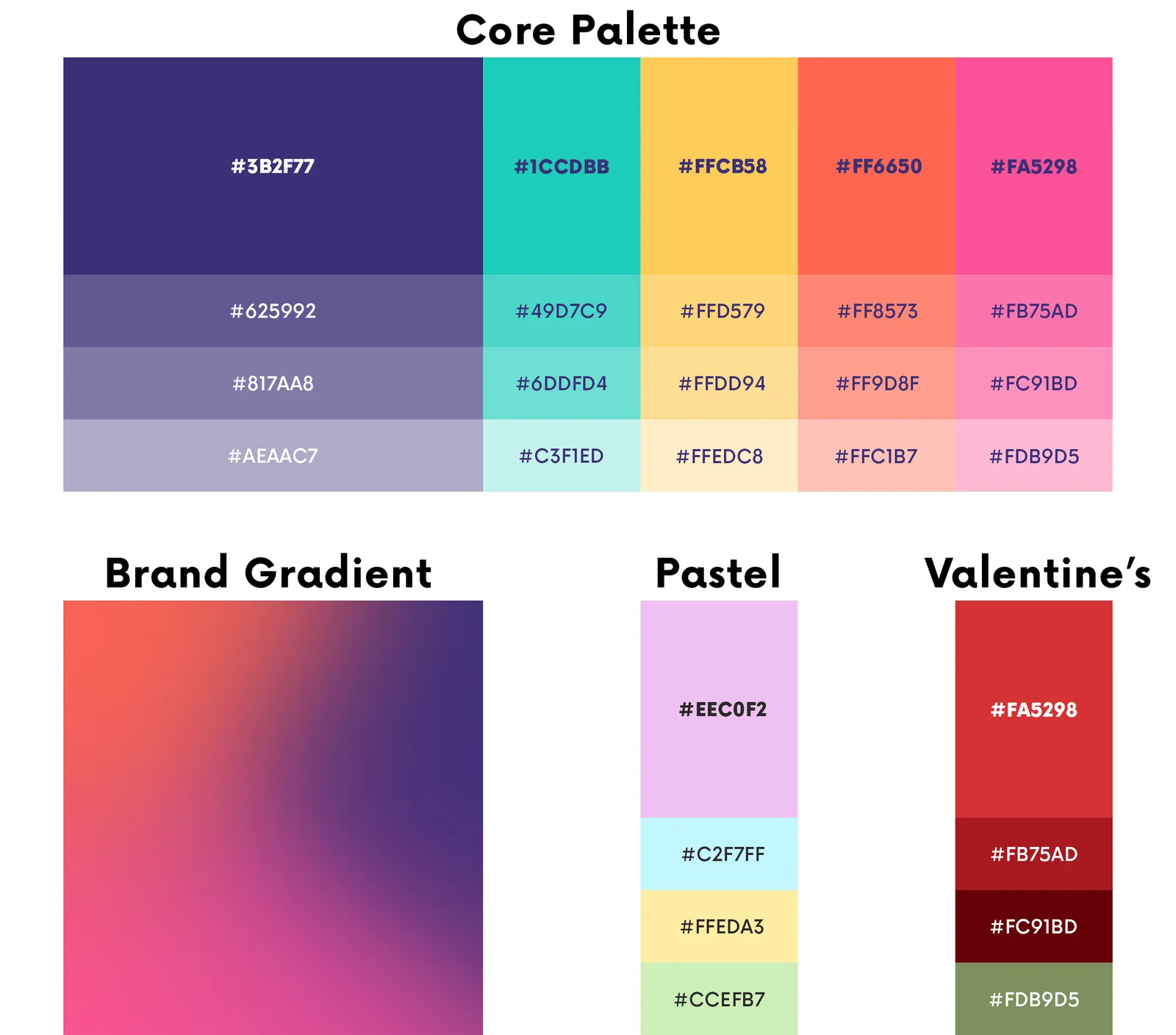
The range is colorful, so the brand leans in. A bold, saturated palette makes the product the hero and the ads recognizable in a feed before anyone reads the logo.
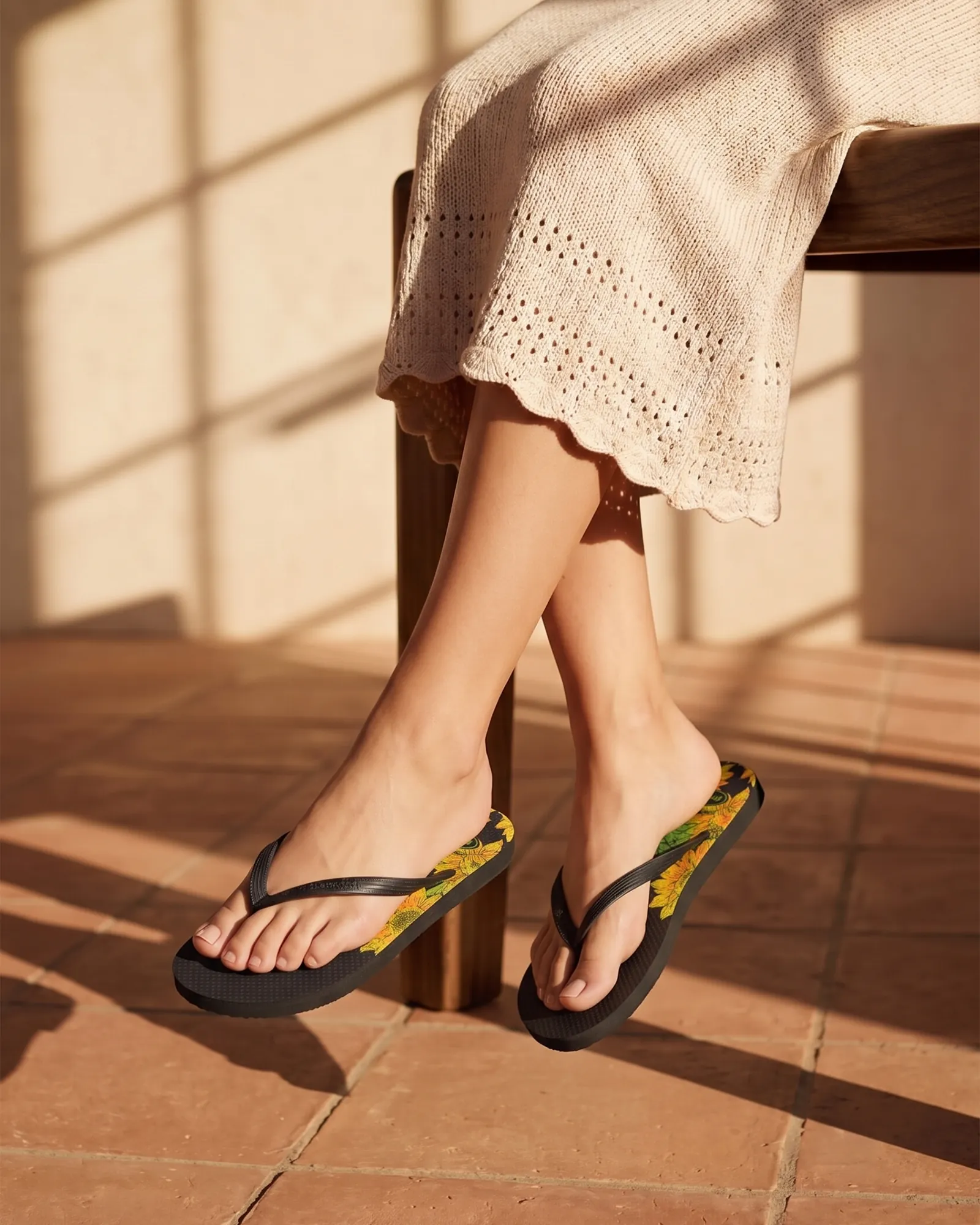
People, texture and summer settings show where the product lives, not just what it looks like.
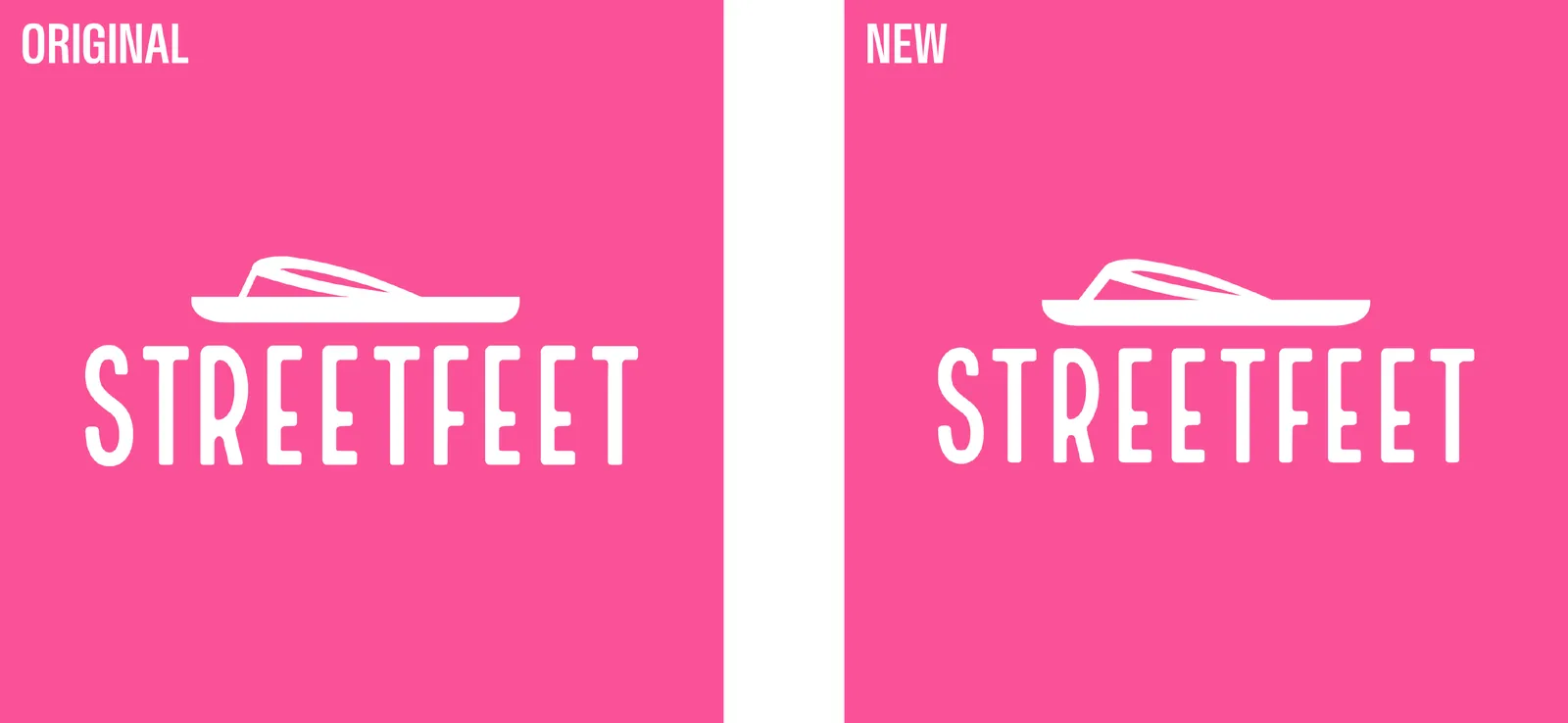
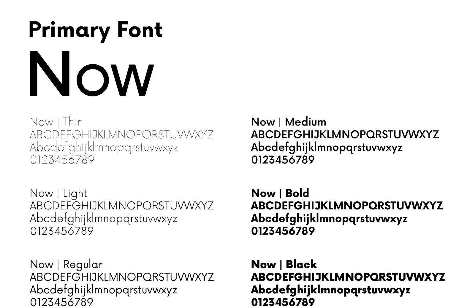
The refresh kept the recognizable logo, but I redrew the icon to make it more balanced and more legible, even as a small icon. Around it, I built a system flexible enough for seasonal campaigns but consistent enough to stay recognizable: a core palette with seasonal extensions, one type family, and a set of rules for visuals and photography.
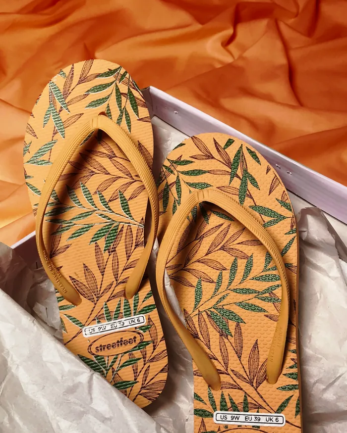
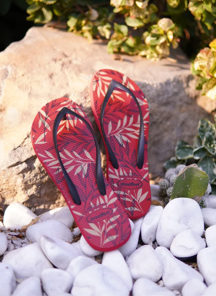
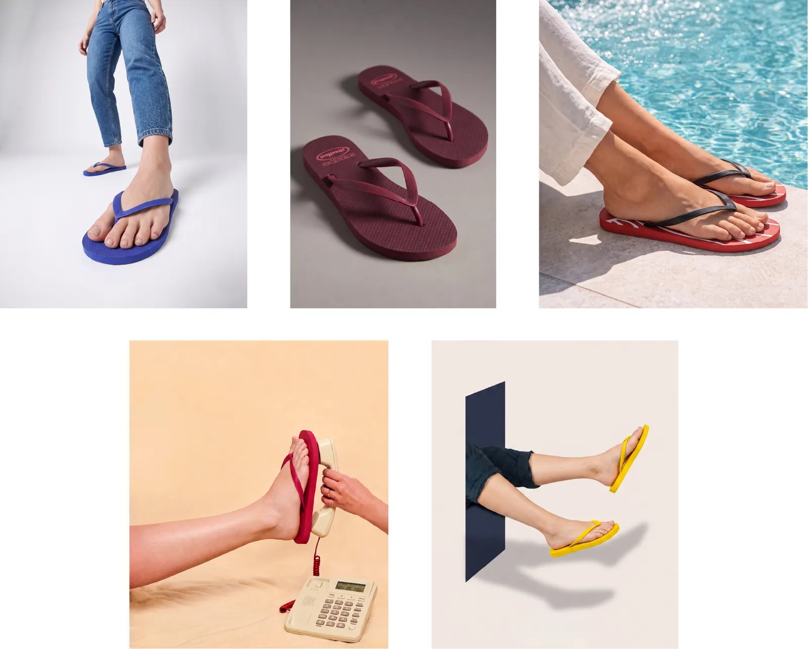
I directed four shoots, each solving a different problem: building a first image library on a tiny budget, launching a collection with a full production, then scaling the imagery with AI without losing the look. Every brief followed the same rules: product as hero, bold color, and visible comfort.
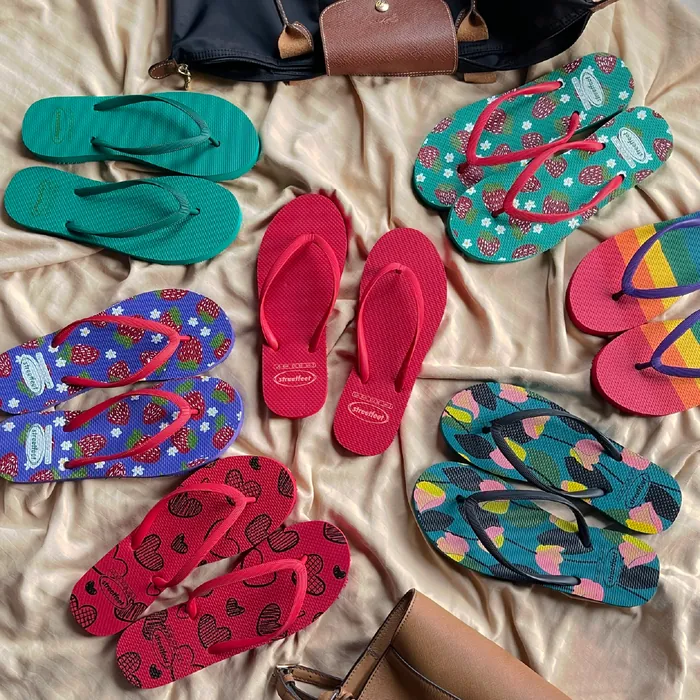
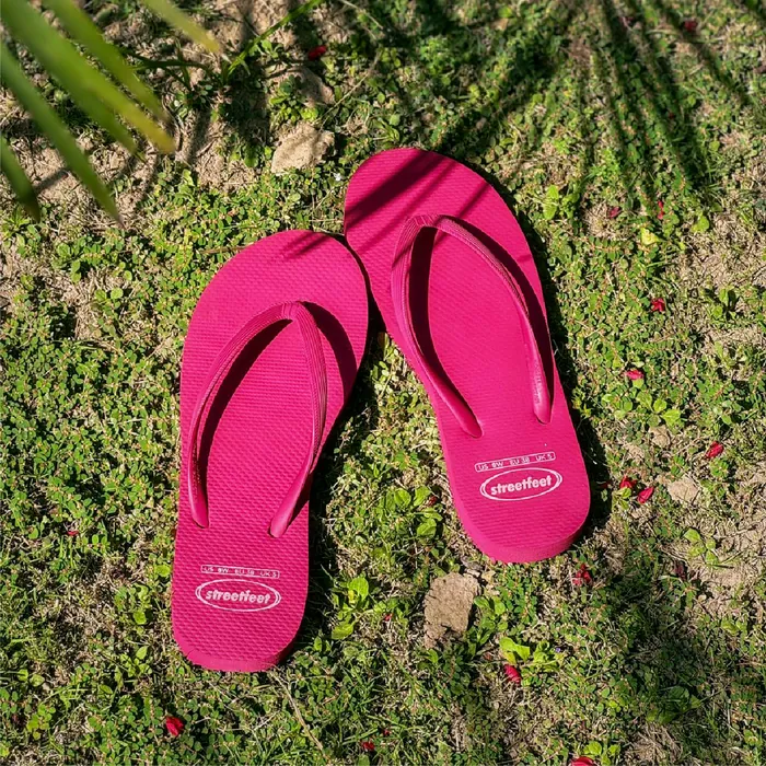
A scrappy first shoot at a private home and a nearby park. With no studio and a minimal budget, I handled styling, shot planning and direction to build the brand’s first lifestyle library.
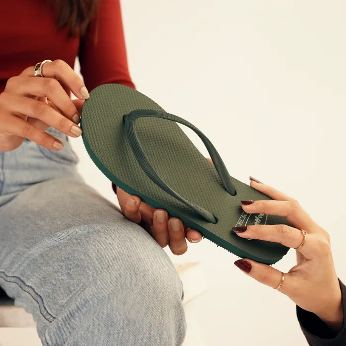
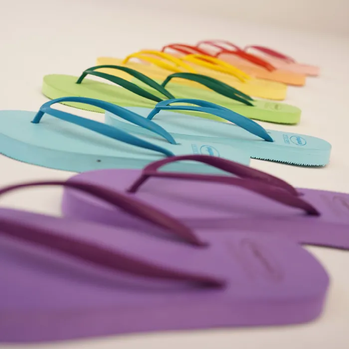
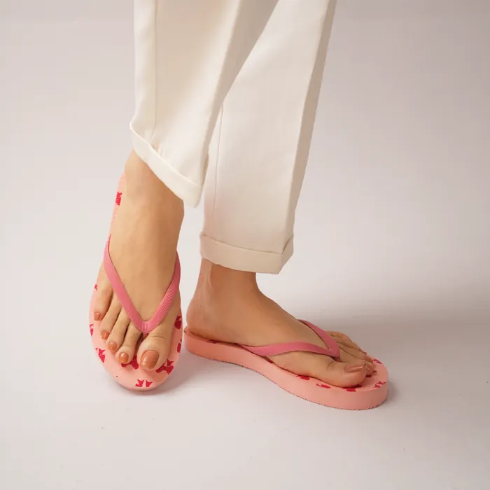
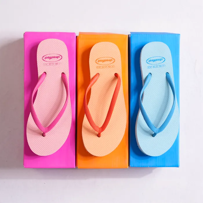
A full production to launch the Pastel Collection and shoot the core catalog. I planned the moodboards, shot list and desired outcomes, then directed the hired team of models, photographers and videographers on set.
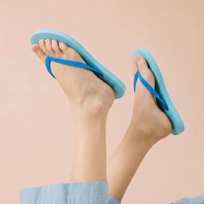
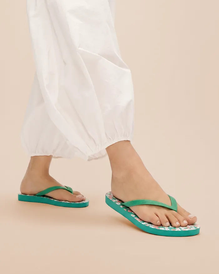
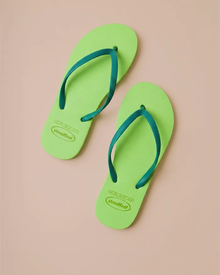
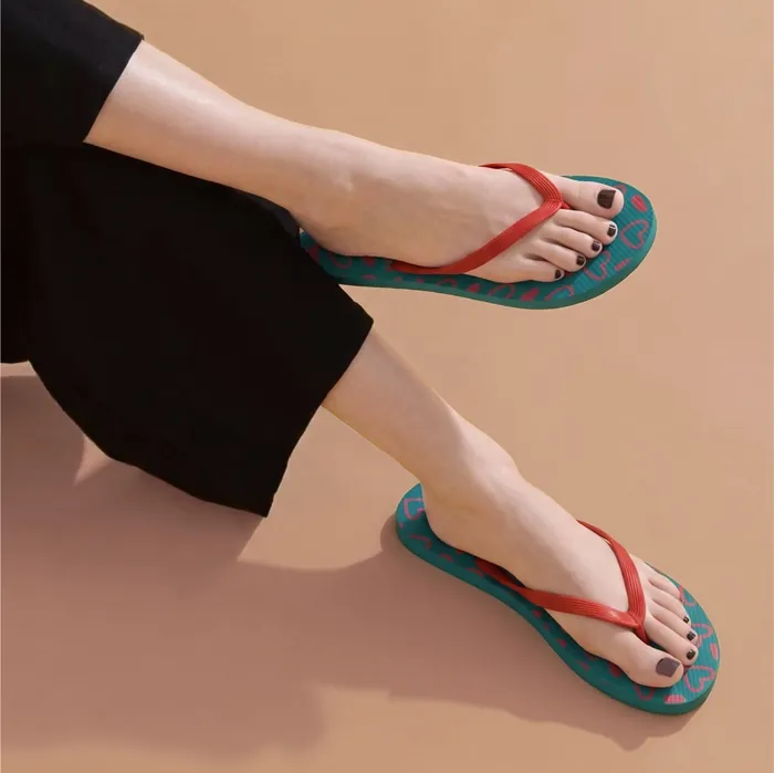
Using the studio shoot as reference, I generated more images in the same set, lighting and style. I photographed each flip-flop from several angles and used those as product references in Nano Banana, so every image replicates the actual design. Every output was checked against the real product, and anything that drifted was regenerated or corrected in Photoshop.
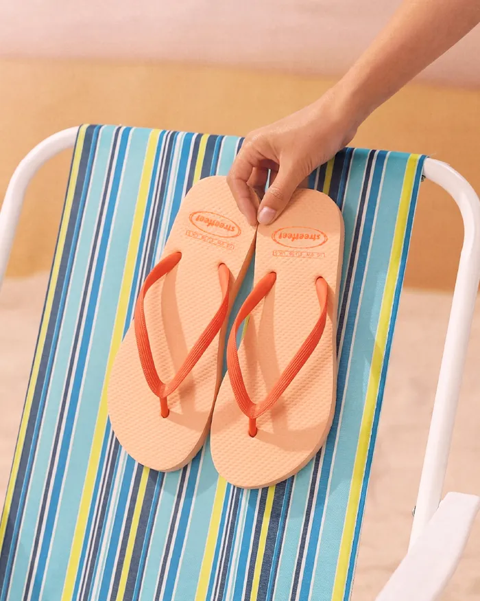
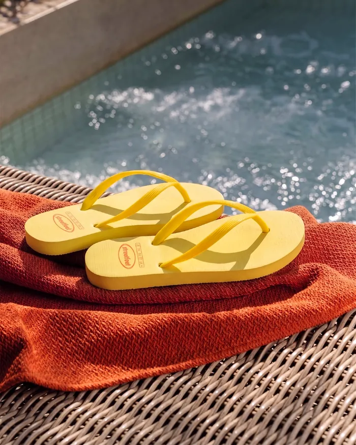
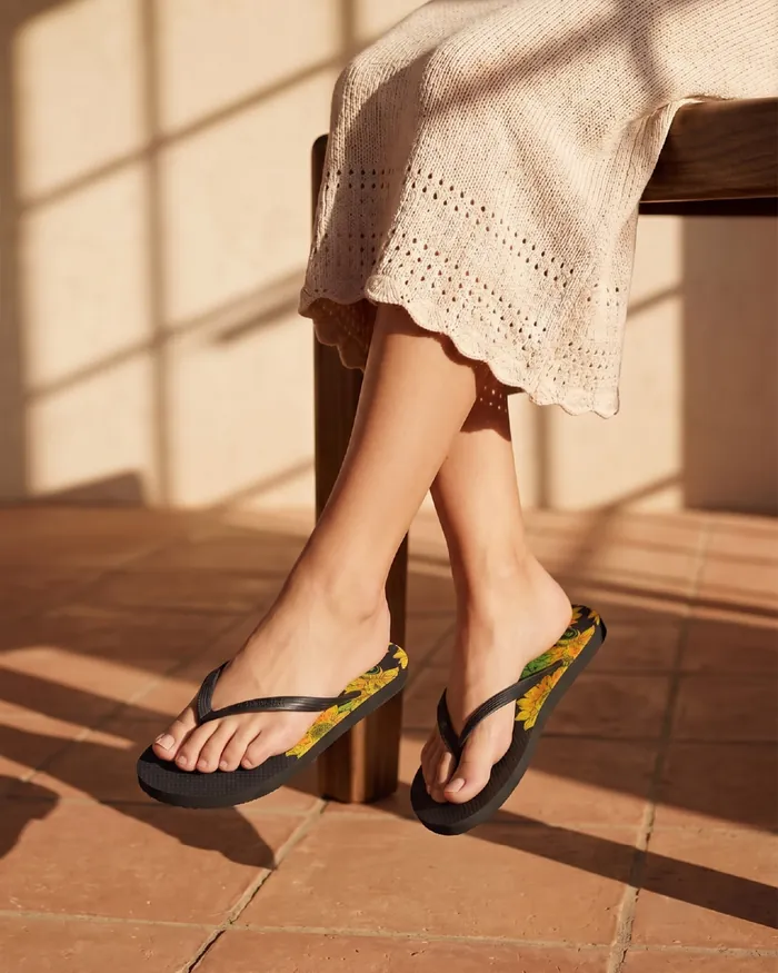
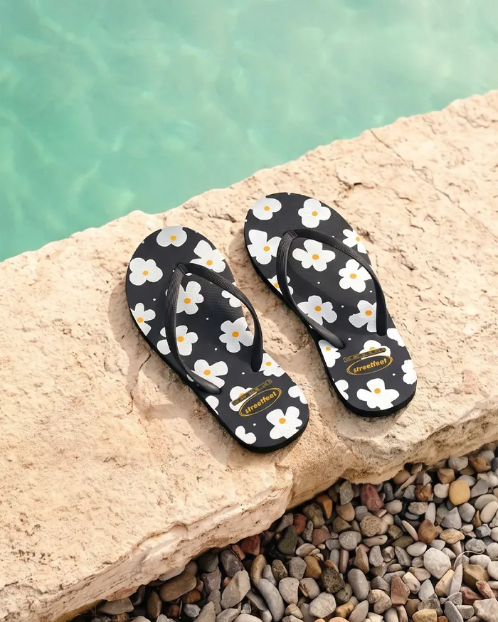
A product-focused beach and pool series with sun-kissed outdoor scenes that would otherwise have needed a location shoot. Built for the peak-summer campaign.
Performance marketing runs on volume: new ads every week to test hooks, products and offers. To keep pace without losing consistency, I built a set of reusable ad templates and a bank of campaign ideas, all following the same rules for logo, color and layout. The result was 20+ Meta ad variations, plus web banners and social posts, all recognizably Streetfeet.
Testing taught us two things
Both learnings fed back into the templates, so each new round of ads started from what was already working.
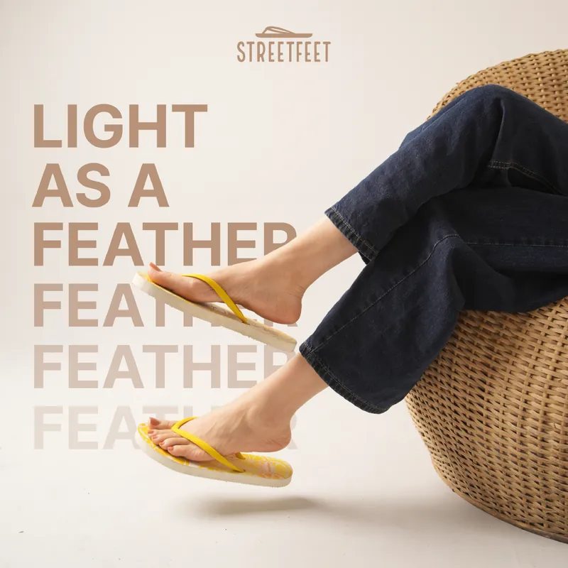
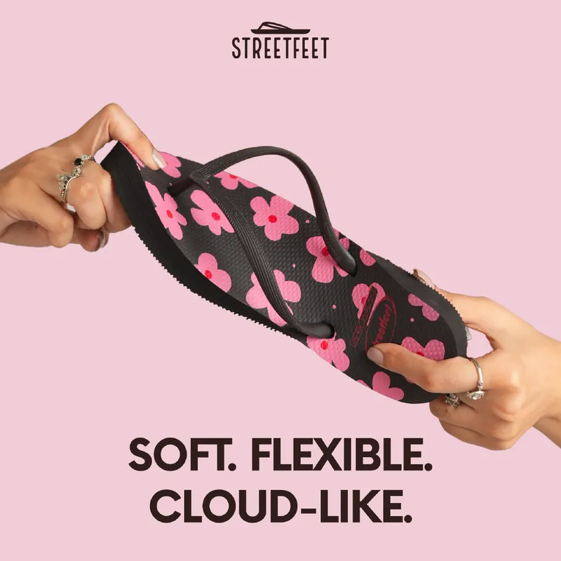
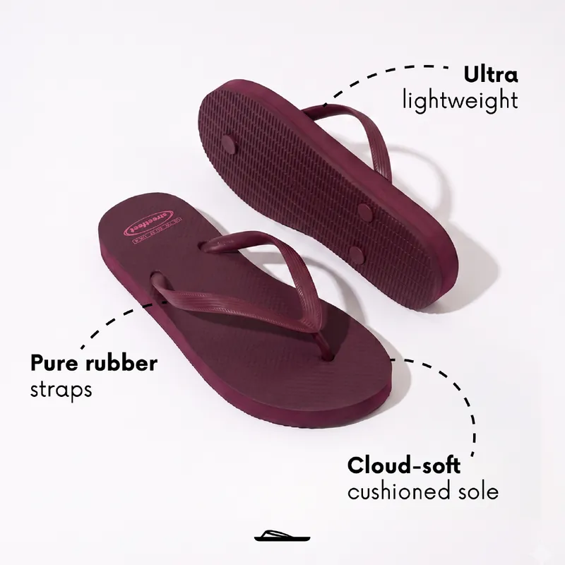
The same system stretched through the seasons and campaigns, each with its own color story inside the core brand.

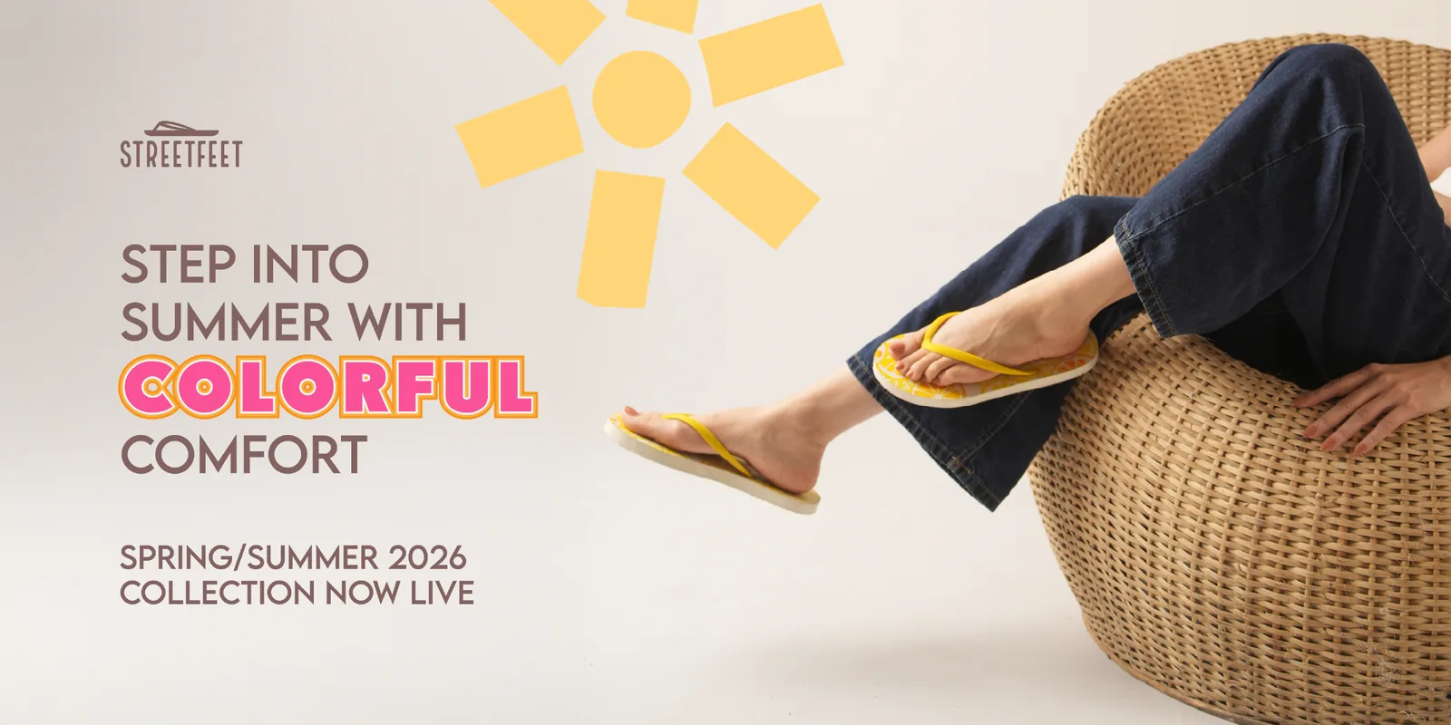
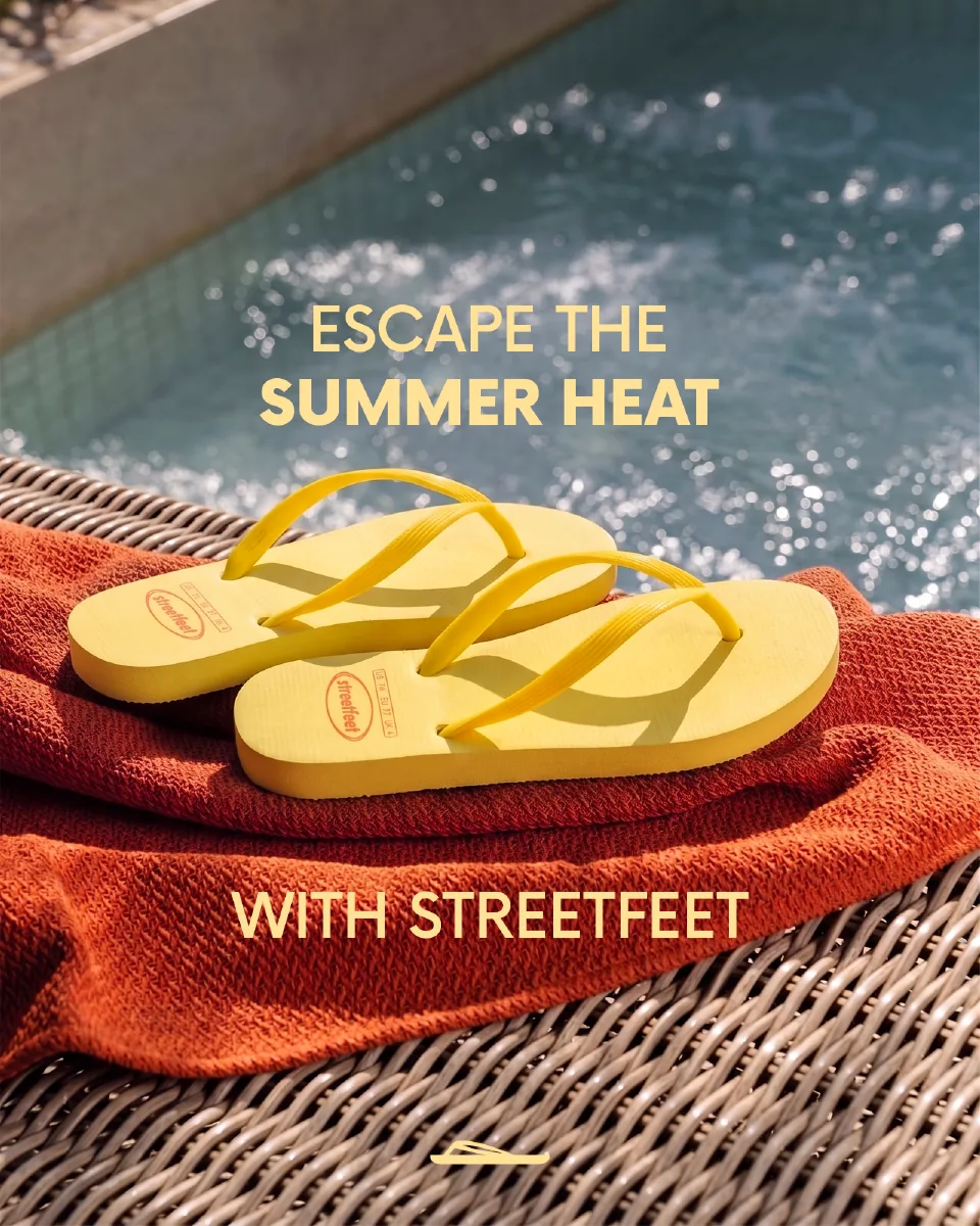
Two Streetfeet campaign shoots were AI-assisted (Higgsfield, Nano Banana). Most of what the tools produced didn’t make it. Some frames broke technically, with distorted feet, unrealistic shadows and warped text. Others were technically fine but wrong for the brand: too dark, too stylised, or so polished they stopped looking real.
I treated generation like a real shoot, with a brief first and every frame judged on two questions: is the product accurate, and does it feel like “Like walking on clouds”? Only images that passed both went live.
Across peak summer 2025, Meta campaigns built on the new system returned 3.6× ROAS, and the DTC site’s conversion rate rose 43% compared to the previous year.
Beyond the numbers, Streetfeet now has an identity customers recognize in their feed, and a production system that ships new creative every week without losing consistency.
“Omar has been Streetfeet’s brand lead for over 2 years, and he’s one of the few designers I’ve worked with who thinks like a marketer as well as an art director… He takes a loose brief and brings back something clear, on brand and ready to launch. Any brand that wants a designer who owns the results would be lucky to have him.”
Now booking
Need ads that sell and still look like you?
Your brand could be next.
Remote · on your hours
Next project